
- Permbajtja
- prev
- next
- prev
- next
HIGHLIGHT: BAROZZI VEIGA ARCHITECTS
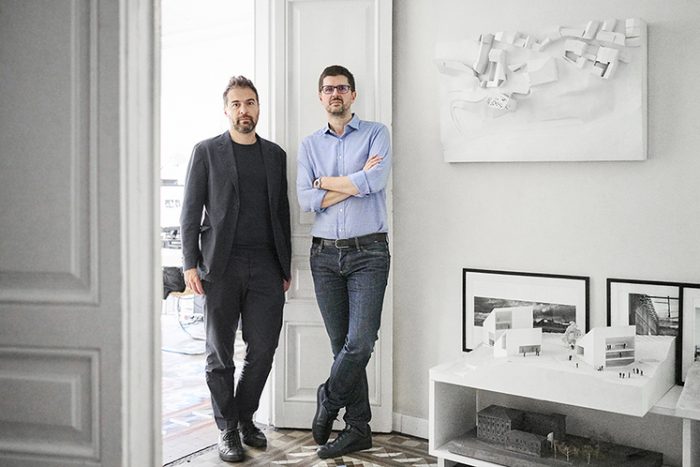
Barozzi Veiga is an architectural office devoted to architecture and urbanism, founded in 2004 in Barcelona by Fabrizio Barozzi and Alberto Veiga. Barozzi Veiga has won numerous prizes in national and international competitions among them, the refurbishment of the Palacio de Santa Clara in Úbeda, the Auditorioum of Águilas, the Headquarter of the D.O. Ribera del Duero in Roa, the Philharmonic Hall in Szczecin, the Musée de Beaux-arts in Lausanne, the extension of the Bündner Kunstmuseum in Chur, the School of Music in Brunico and the Tanzhaus in Zürich.
The work of Barozzi Veiga has been presented in different exhibitions and has been published in a wide range of specialist literature. Barozzi Veiga has won many international awards and citations for design excellence among them the Ajac Award 2007 granted by the College of Architects of Barcelona, the International Architecture Award “Barbara Cappochin” 2011, the Gold medal for Italian Architecture 2012 granted by the IV edition of the Triennale Milan, the Young Talent of Italian Architecture 2013 Award granted by the National Council of Architects, Planners and Landscape architects of Italy. In 2014 the studio was selected to be one of the 10 firms in this year’s Design Vanguard by the Architectural Record magazine.
Recently the studio has won the European Union Prize for Contemporary Architecture - Mies van der Rohe Award 2015.
Selected Projects
Tanzhaus Zürich, Zürich Switzerland, 2014–2019
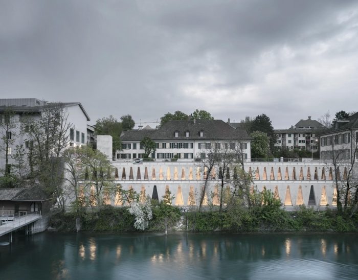
The project seeks to reactivate the promenade along the Limmat River, transforming and redefining the current residential conditions of its location. In this way, the building is defined as a simple and tiered volume. An element that enables a new public space to be generated on its roof and that connects the existing itineraries at different levels that intertwine along its bank.
The building resolves the relationship with its surroundings through the definition of its main façade. Composed through the repetition of a singular element, that enables the building to be integrated into the Limmat’s urban environment, the triangular openings characterize the main interior spaces of the building, and singularize its visual impact through the vegetation along the riverside, providing the Dance school with a distinctive identity.
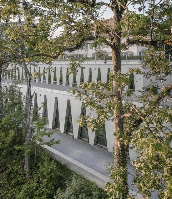
The programme is clearly organized across two levels, separating private uses on the upper level from public uses on the lower one. This division permits, firstly, different accesses, which activate the circulation around the building, and secondly, work with different scales on the two levels, reinforcing the building’s public nature at the level in direct contact with the Limmat.
International competition. First Prize. Built.
Images ©Simon Menges
Musée cantonal des Beaux-Arts, Lausanne Switzerland 2011-2019
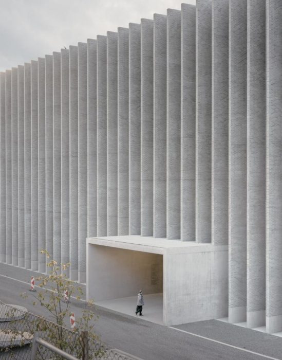
The project aims to transform an area of Lausanne into a new arts district, centred around the city’s three main museums: Fine Arts, Photography and the Museum of Design and Contemporary Applied Arts. All this activity is sited within a very complex urban setting, affected by old railway yards currently in a state of disuse.
As for the urban strategy, the decision to unveil this part of the city and connect it with the Station Square entails sacrificing the 19th-century building that exists on the site to generate a new public space. The idea is for the three new buildings to gravitate around this open space and to be understood as a single entity. The design features a collection of found fragments, incorporating them from the start. The building’s new foyer emerges from the end facade of a former train shed like an objet trouvé. This ultimately becomes the design’s main compositional element from which the museum’s entire programme comes to life. Hence, elements such as this facade, some stretches of train tracks or the arches of the northern wall act as spring mechanisms to trigger the memory of the place and allow it a clear presence within the ensemble.
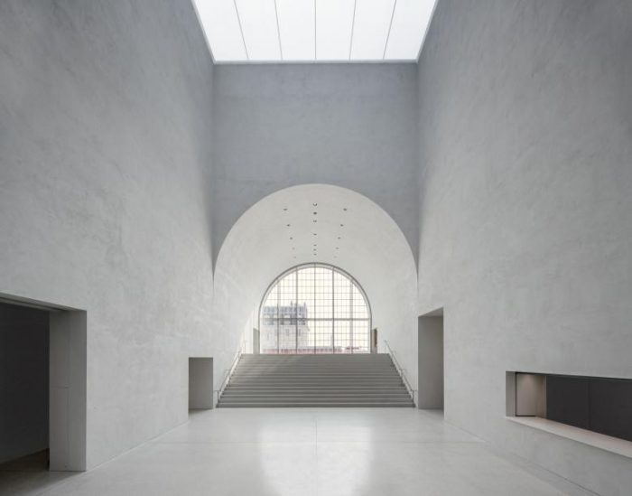
As in a large industrial factory where structure takes priority over the composition of facades, the building can be defined as an inhabited wall that separates, with precision, the industrial world from the new public space.
This project is based on an apparently contradictory equilibrium between the specificity of the place and the formal autonomy of the building, which is conditioned by its solitary situation. Structure, programme and construction converge in a unitary conglomeration, demonstrating its validity and functionality despite the context’s transformation.
International competition. First Prize. Built.
Images ©Simon Menges
Music School, Italy
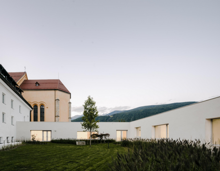
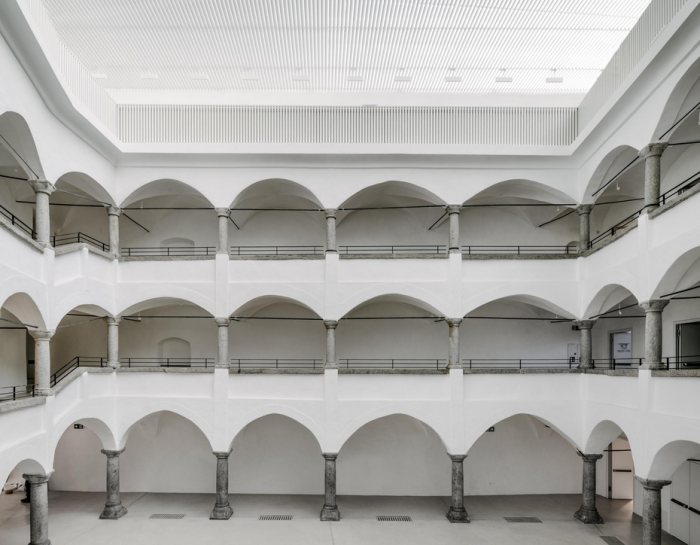
The historical centre of Brunico, in the Italian Alps, is a unique urban agglomeration characterized by a series of aristocratic villas. Typologically, they feature a large garden enclosed by walls. One of these villas – Villa Ragen – is home to the current music school. The project consists of extending the villa by occupying grounds that were previously occupied by the totality of the garden.
With the initial premise of preserving the character of Villa Ragen, the design for the music school proposes an alternative relationship with its context. The school’s extension is developed based on the building’s typology and its urban setting, a system of houses each with a wall surrounding an enclosed garden. In the same manner, a wall that encloses a garden is created for the school and becomes the reference space that the classrooms and rehearsal rooms look onto.
This wall is simply an ‘inhabited border’ that responds to two main goals: firstly, it gives continuity to the existing urban fabric, completing the urban layout that is subject to conservation, and secondly, it highlights the urban presence of Villa Ragen, so that the extension is understood as a low-key building that complements the pre-existing architecture.
International competition. First Prize. Built.
Images ©Simon Menges
Philharmonic Hall
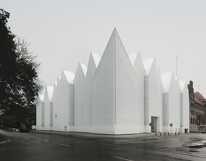
The Philharmonic Hall, which is to accommodate a concert hall and a chamber music hall, is a very complex building that occupies the same space as the former music building. This is a synthetic project that shares identifying traits with its surrounding context. Mass, verticality and the shape of the roofl ines are dominant, connecting the hall with the rest of the city.
The expressive preeminence of the building, concentrated along its perimeter and the pattern that shapes its roof, results from the influence of some of Central Europe’s expressionist architecture. From the outside, the building is perceived as a weightless volume in which the glass facade—sometimes translucid, sometimes opaque—transmits expressive qualities depending on the building’s use. On the inside, the concentration of the service areas and communication elements along the perimeter creates a sensitive relationship of the building with the exterior while at the same time it delimits a large open space, set aside for the symphonic and chamber music halls to play their main roles.
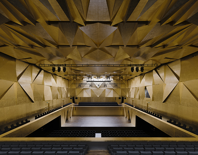
Images ©Simon Menges
Regulatory Council for the D.O. Ribera del Duero
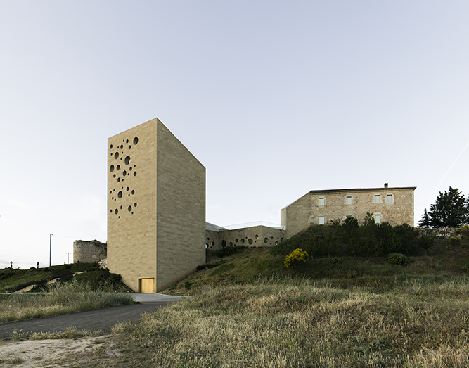
The fundamental attribute of the design resides in the border area where the building is set, next to the old walls of Roa de Duero and on the edge of the town—between artifice and nature, between the city and the landscape. The building, which accommodates the Regulating Committee of the Ribera del Duero wines, contains offices, reception areas and a small auditorium. All of these spaces revolve around the notion of public space. With regards to the city, the design is attentive and works at a small scale, suturing and recomposing the urban tissue by modeling volumes whose premise is to construct a public square.
The building’s identity comes from its relationship with the landscape, although it also stems from a symbolic void capable of becoming a reference for the place. Work on this space, which synthesizes the ideas of nature and artifice, will eventually lead to exploring a new interest that will intensify in our later work: architecture’s material condition.
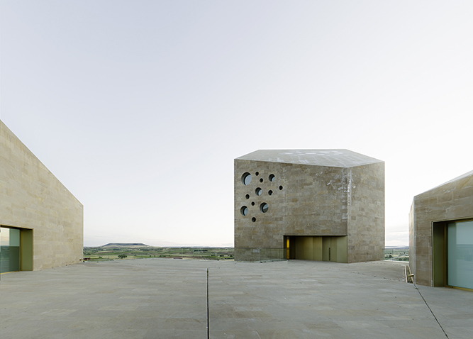
Images ©Simon Menges
Solo House, Cretas Spain, 2014
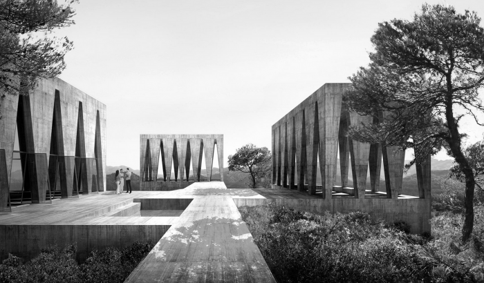
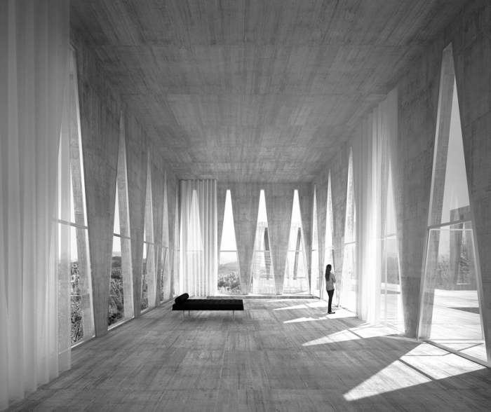
Surrounded by pine forests and facing the south, the house is located in an area near the Matarraña river. Composed through the arrangement of four abstract volumes, the house reveals a new landscape, a site which enables a new style of inhabitation.
A plinth defines the base that connects the four pavilions. Each one of these structures accommodates a different programme. From the access path, reached by crossing a pine forest, we arrive at the Entrance Pavilion: shadows and a pond form a cool and shady threshold for the house.
From this point, the remaining volumes appear like cut-outs against the landscape and the horizon. The swimming pool, located to the south, readopts the tradition of bathing areas to work with water as an architectural element. The dining pavilion is located to the west, a covered space, with a fountain and a fireplace, open to the exterior. On the eastern side is an enclosed volume, a large open space with a series of free-standing furniture items and designed for daily living. The private areas with bedrooms and bathrooms are housed inside the plinth.
Images ©Simon Menges
Graubünden Museum of Fine Arts
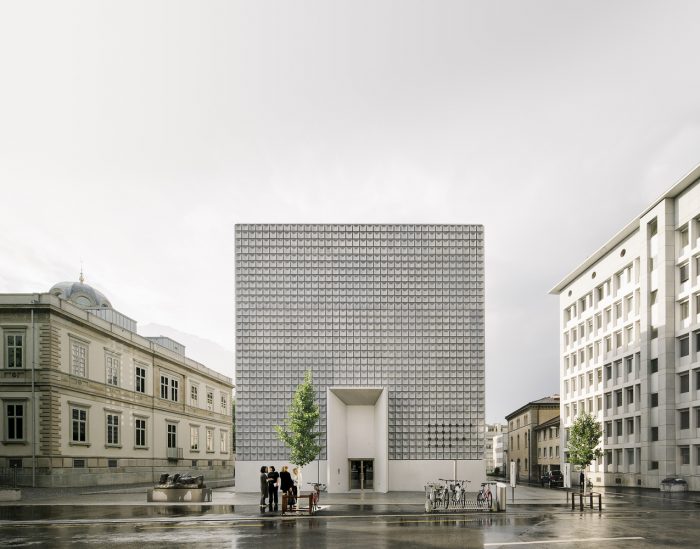
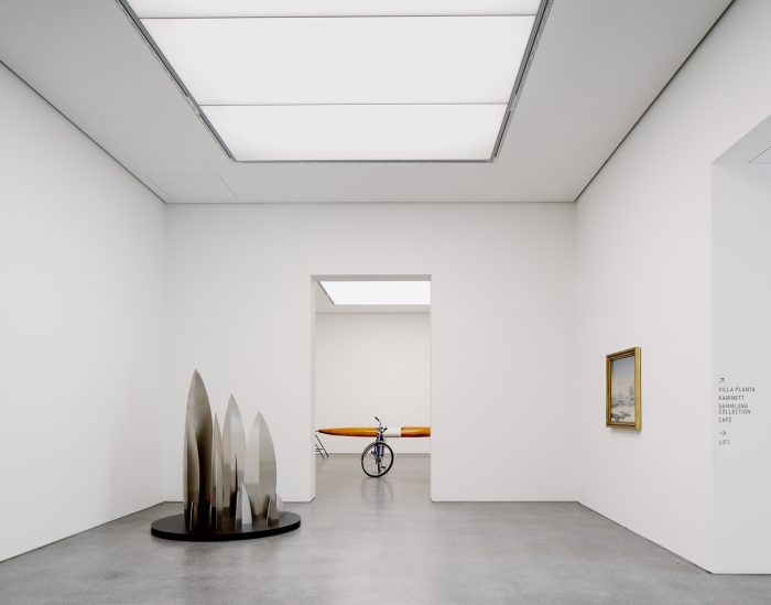
The project absorbs and transforms the Palladian order and the Orientalist style, the main compositional features of the Villa Planta, through a central and symmetric composition scheme which gives the extension a clear formal autonomy as well as allowing the proposal to preserve the identity of the villa itself. The new addition to the Bündner Kunstmuseum is conceived as a simple and compact volume that becomes perfectly integrated into its immediate surroundings.
The clarity with which it states its independence with respect to the adjacent buildings also reinforces the importance given to the garden that appears in the newly extended area and confers a sober presence to the building.
Images ©Simon Menges
Artists’ Atelier, London, England, 2016–21
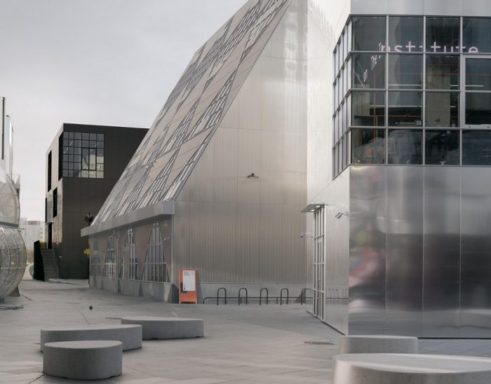
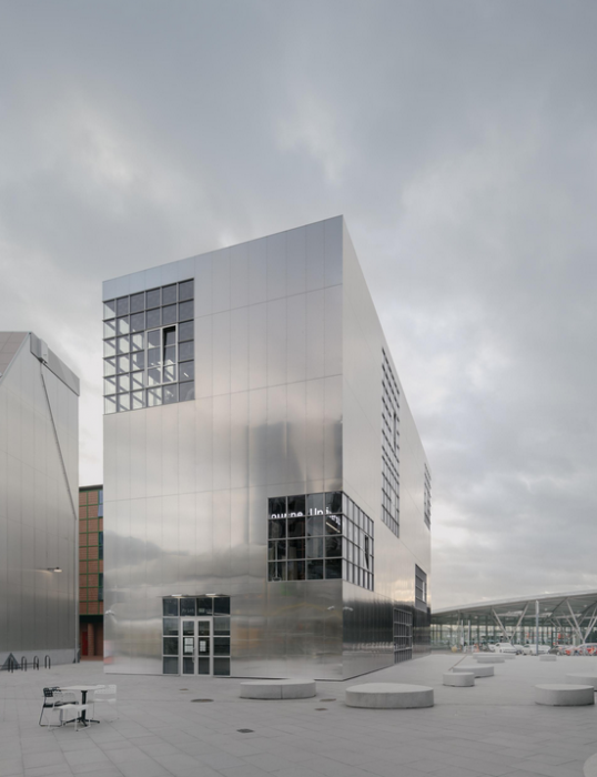
Design District in the Greenwich Peninsula is a new one-hectare neighbourhood of 16 buildings that will provide a permanent base for creative businesses to trade, interact and grow. Eight emerging architectural practices selected across Europe have been given a pair of buildings to design independently and ‘blind’ from each other, creating a provocative diversity of colour and form. The two buildings by Barozzi Veiga are simple and elegant volumes that seek to have an adequate proportion with their surroundings. The reflection of light on the polished aluminium facades of the buildings changes throughout the day and appears different in each season. All year round, they give luminosity to the surrounding courtyards and alleys. The buildings are designed with photographers, artists and sculptors in mind: large windows, external staircases and high ceilings.
Private Commission. Built.
Images ©Simon Menges
Source: Barozzi Veiga Architects

 Shqip
Shqip