
- Permbajtja
- prev
- next
- prev
- next
HIGHLIGHT: CARLOS CASTANHEIRA ARCHITECTS
Life and education of Carlos Castanheira
Born in Lisbon, Carlos Castanheira (1957) is part of a generation of Portuguese architects considered the professional progeny of Alvaro Siza, with whom Castanheira worked for fourteen years and with whom he has collaborated on several occasions, including in recent years.
Graduating in architecture from the School of Fine Arts, Porto (1981), Castanheira lived in Amsterdam for almost the whole of the Eighties. He launched his professional career whilst continuing to study at the Accademia Voor Bouwkunst Van Amsterdam. In 1993 Carlos Castanheira founded his design studio Carlos Castanheira & Clara Bastai, Arquitectos Lda. alongside architect Maria Clara Bastai.
Working primarily in the residential sector, he is primarily noted for his work with timber structures and architectural components, mainly focused on construction details.
Examples include the following houses in Portugal: Casa Quinta da Buraca III (2001) and Casa Avenal (2004), both at Oliveira de Azeméis, Casa Ribeira de Abade in Gondomar (2005) and Casa Adpropeixe in Gerês (2008).
Over the years, his designs have featured his characteristic use of wood in combination with other different materials as a reflection of the interaction between built and natural worlds.
Projects
Treetop Walk Serralves
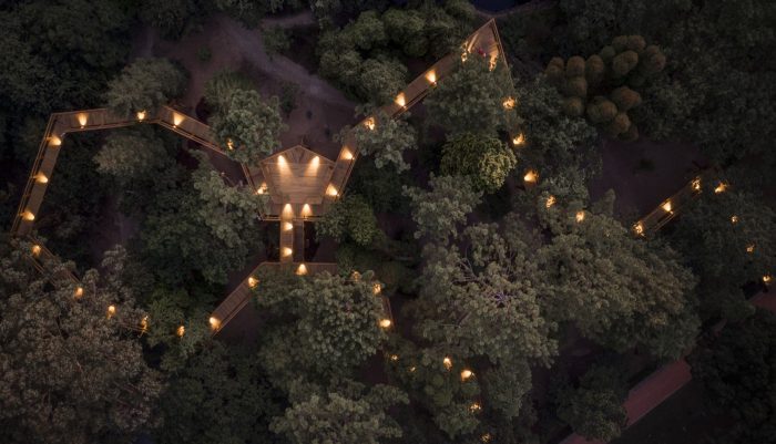
A visit to Serralves is always a walk through space, in time or in the time of space. Creating a new walk that complements the existing ones, could only be IN THE CANOPY of the beautiful and imposing trees of the Park. The walk starts at the furthest eastern end of the Park – just where the “Casa do Cinema” is now being built – it rises gently, bringing us up into the tree canopy, as the ground runs away beneath our feet, it rises skyward.
The Building on the Water
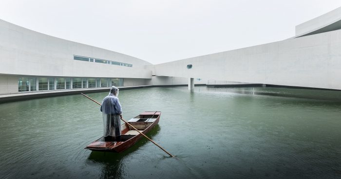
The idea of placing the main office building on water was implicit in the master plan for the factory, as this primarily chemical industry needs a reservoir to ensure its permanent, constant production.
The curved shape of the volume, accessed across two bridges, makes it seem to move as one approach and moves away. The extremely simple organization is distributed on two levels: the main entrance is on the east side, where the central foyer provides access to the work area in a south-facing unit, with another north-facing unit for the social and exhibition zones. The service entrance, restaurant and kitchen areas all face north. The administration zones and facilities of the associate companies are on the upper floor.
Mimesis Museum
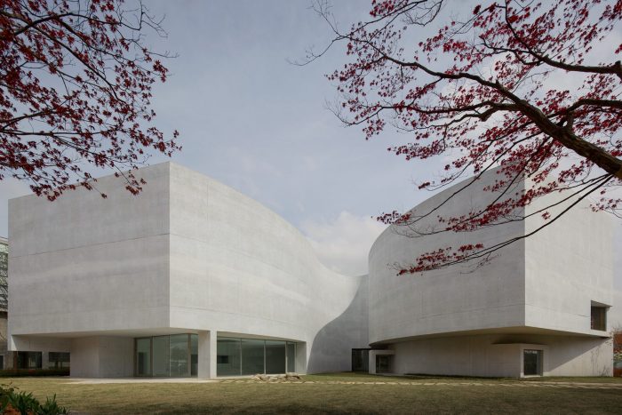
In architecture, after an initial sketch comes the torment. The initial design, models, drawings, corrections to these, doubts, new drawings, new models, a presentation to the client, who had already seen other projects but could not conceal his surprise at this one. Once approved, we progressed the project on through the usual steps, which in Korea are shorter and less bureaucratic. Light, always light, so carefully studied. Both natural and artificial is seen as essential. Allowing to see without being seen. Models and more models were constructed, some of which you could enter into. Also 3D images. Form will be given by cast concrete, light grey, the colour of a cat. Inside, the white of the walls and ceilings, of the marble, which we hope will be from Estremoz and also the honey colour of Oak. Timber for the internal frames, and glass. As for the external windows, timber, painted steel and crystalline glass.
Saya Park Art Pavilion
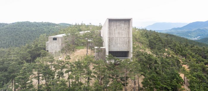
The Art Pavilion modified the hill site and also adapted itself to it. And we all also, adapted ourselves to the beauty of this project. There was a strong will to build this particular idea on that site and all the challenges were overcome. The forest pathway makes its way between high concrete walls, rough in texture, but elegant in form.
We pass an isolated volume, destined for study and information; the Library.
Quinta do Buraco – House I
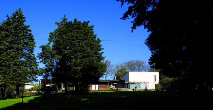
On site there was a small stone ruin, with three compartments and this was the start. One compartment became the entrance hall, another, the kitchen and the third a dining room.
The hall gives access to a timber volume that accommodates the bedrooms on the western side, and also to the volume of the ruin which has been restored and integrated with the concrete volume of living room and library.
Outhouses and service areas have become a retaining wall to the North.
Tivinha House
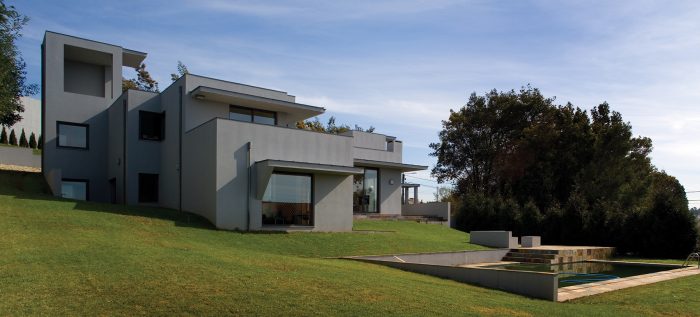
On this piece of land, zoned as two separate sites, a long and absurd battle had to be fought before permission was obtained for a single dwelling. The neighborhood, which might have put some people off, was and is, for the Client a source of great tranquility. The presence of the graveyard, to the East, is quite conspicuous, not for any evil that might become for the presence of the dead, but more so because of the atrocities built by in the area the living.
Research and Design Center. AMORE PACIFIC
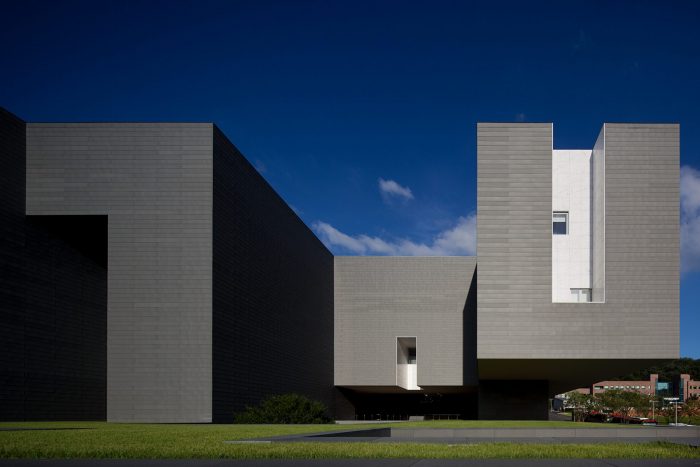
Despite being a box or a container for functions, the richness in the simple use of materials transforms it into a kind of Pandora’s Box in reverse, out of which come the most beautiful things that transform the least beautiful women in the kingdom of Korea.
Spiritual Pavillion
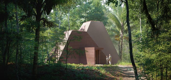
The Spiritual Pavilion was planned so that, immediately on approach, one would get closer to the mysterious.
We are bewildered by the volumes that rise skyward, as if searching for something. Or, to receive something.
We enter through a narrow doorway. Compressed.
First the smaller volume. An antechamber and functional.
Source: Carlos Castanheira Architects

 Shqip
Shqip