Të dhëna mbi projektin
-
Studio
Ledia Lazi
-
Arkitekti
Ledia Lazi
-
Faqja e Arkitektit
-
Tipologjia
Interior Design
-
Statusi
Completed
-
Viti i ndërtimit
2020
-
Kate
1
-
Photography
Ledia Lazi
Përshkrimi
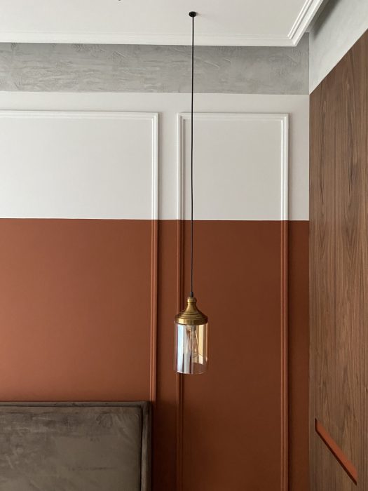
Are you ready to explore a neutral color palette? Ledia Lazi Architect presents to us the Ap4_LIDA project, realized in a modern style intertwined with neoclassical elements, where the most evident are the composition of frames, large windows and high ceilings. The combination of white, cream, beige, brown, gray and black is best balanced in a space which includes the function of living room, kitchen and dining area.
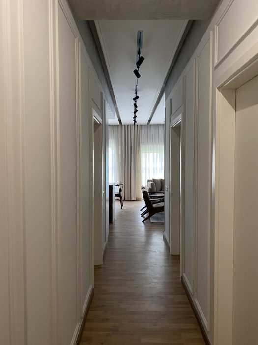
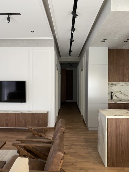
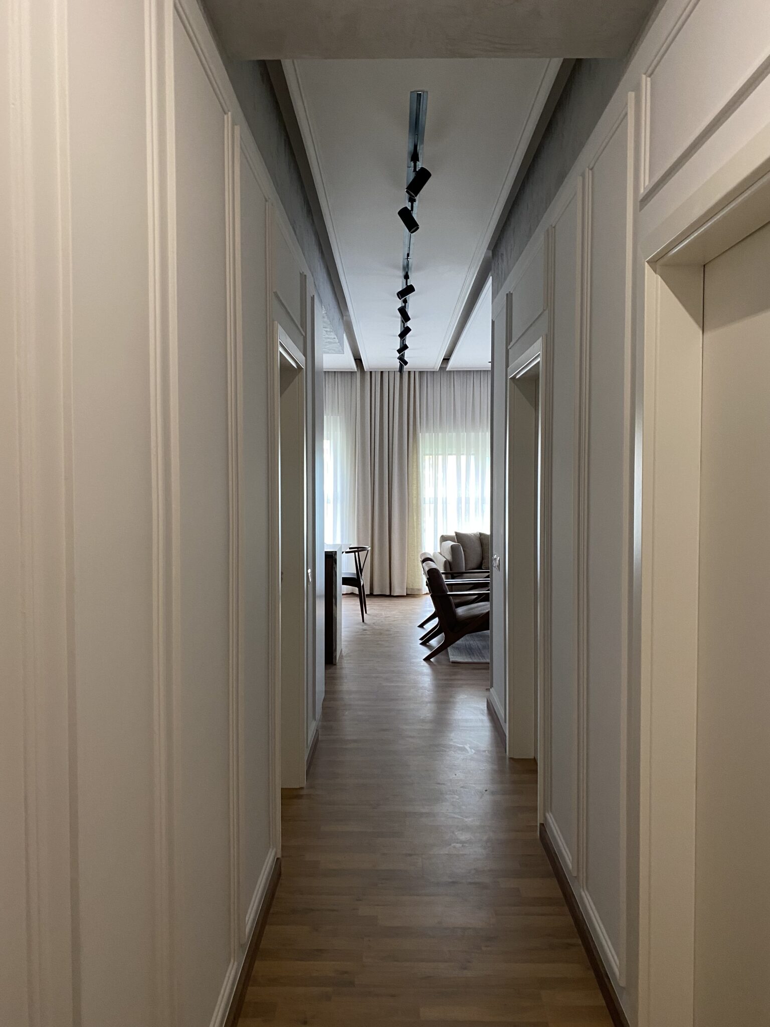
One of the functional spaces in which revolves the concept of the whole apartment is the corridor. A long linear entrance composed with the detail of the frames which, while walking in it, reveals the position of the rooms and toilets. At the end of the hallway, as a surprise, unfolds the entire living space filled with light, where all the used colors and materials can be read.
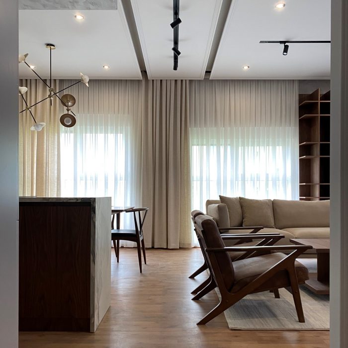
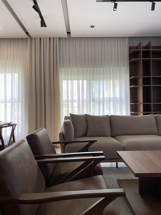
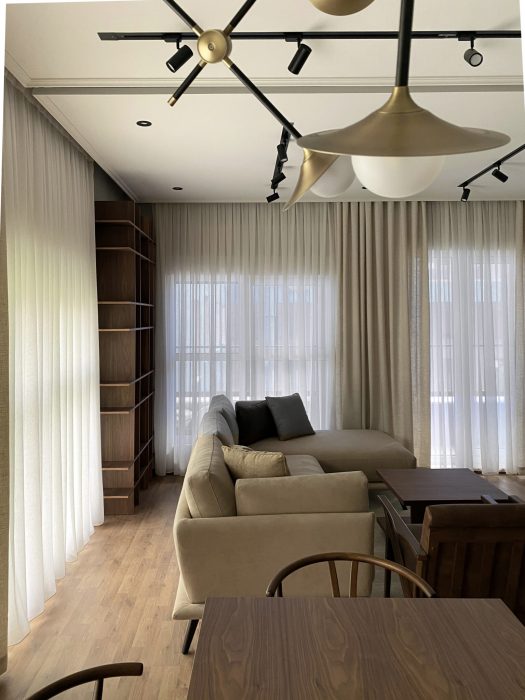
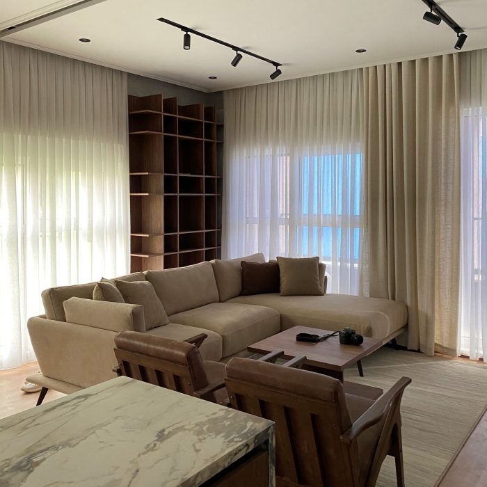
In the pictures above you can see the bookshelf in walnut wood, composed as a simple and minimalist structure which is positioned behind a beige sofa. Inside the perimeter of the cream-colored carpet are placed two armchairs with wooden structure and dark brown leather.
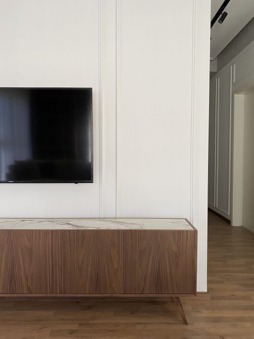
The whole plan of the living room is positioned opposite the corner of the TV. A furniture in walnut wood structure and marble top gets all the attention. A floor lamp stands next to it, becomes part of this minimalist composition.
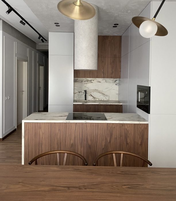
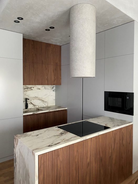
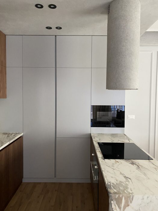
The kitchen is the heart of this space. I love how its plan looks over the living and dining area. The gray color of the shelves connects best with the wood material creating a contrast which also highlights the distribution of functions. The marble island in brown and gray pattern fits nicely into the concept of space, enabling the balancing of materials given that the use of wood is massive.
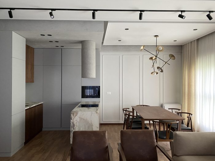
A very obvious element is the cylindrical hood in concrete texture. It comes down from the kitchen ceiling (also in concrete texture), where in addition to function, it looks almost like a minimalist installation which does not affect the image of this space at all.
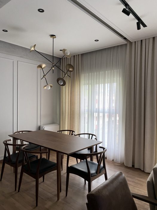
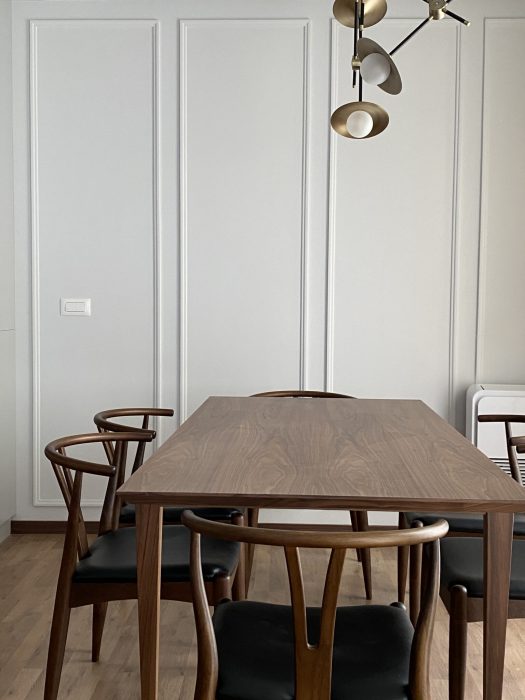
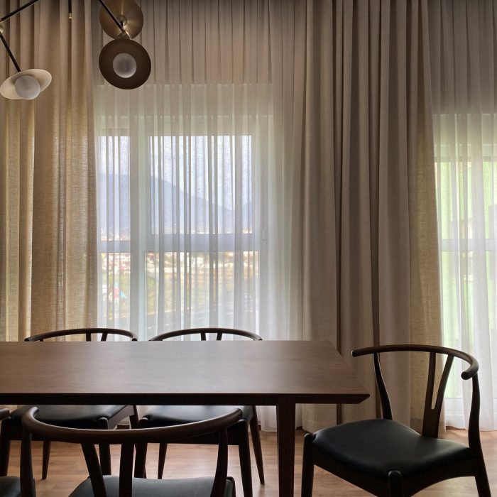
Part of this composition triangle remains the dining room which is positioned next to the big windows. The light covers the whole space giving it a touch of warmth and highlighting its neoclassical character. The chairs, in their elegant wooden structure, are placed on the perimeter of the table positioned in the center of this plan.
Vendndodhja
Tirana, Tirana, Albania

