- Permbajtja
- prev
- next
- prev
- next
The psychology of colors in architecture!
The vibrant world we live in would not be the same without colors!
The effects of colors profoundly affect not only the perception of the world but also the state of mind of people. Why do colors have such a meaningful impact in our lives?
Beside the symbolic that colors carry, often certain behaviours and emotions can be evoked through visually implementing the right colors.
Imagine how would you feel if you wake up in purple room or in white tones bedroom. Obviously the feelings would not be the same!
Where would you think you would be more productive in a gray office or in an office where yellow predominates?
The relationship between design and color is extremely complex and is closely related not only to symbolism, mysticism, culture but also to the historical period, as their perception varies precisely depending on the time, place and designer who implemented them
Even Le Corbusier in his early carrier, in an article co-authored with Amédée Ozenfant on Cubism and Purism stated that form is essential and colors are merely an accessory! Meanwhile, his approach to using colors in design around the ’30s changed completely. In his writings on polychromatic architecture (the use of many colors), he agrees with Fernand Leger, who states that "Man needs colors to live, an element as essential as water and fire."
Le Corbusier describes examples of his new aproach to th use of color in order to drastically change the spatial perception of architecture, as in the neighborhood designed and built in Pessac.
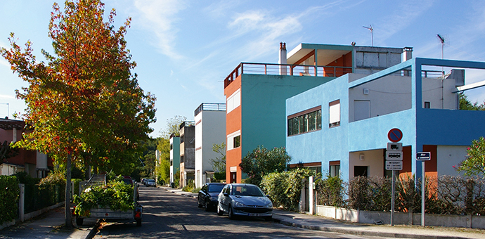
Image source: HEI Alumni
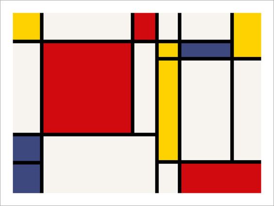
The Dutch neoplasticism movement, De Stijl stemming from the abstract paintings of Mondrian, helped to create a better consciousness about color theory and practice, introducing color as determinant of space, in opposition to its traditional decorative function.
Mondrian-
Colors are an important element in design, as all the other elements they carry an important role for the perception of the space and evoke the right emotions.
However, the colors carry their symbolism and we will try to explain the main ones in this article, illustrated with examples from the projects published in pikark:
THE WHITE COLOR
White is associated with purity and peace! Also closely related to spirituality, simplicity and cleanliness.
Definitely is the wright color for spaces that recall the peace of mind and spirit, that usually go toward a minimalist style. Being a symbol of purity, it is highly linked to project related to medical facilities such as hospitals, clinics, etc.
White is the predominant color for spaces that create visual and spiritual serenity such as yoga and meditation centres.
As many you know, white is the favourite color of modern architecture as architecture had to be stripped of its ornaments and relate to pure forms!
Even for architects of ourdays, white is the color for famous architects to express themselves such as Campo Baeza, Alvaro Siza, or even “ the New York 5 Whites”: Peter Eisenman, Michael Graves, Charles Gwathmey and Richard Meier, who were dedicated to experimenting with the ideology of modern architecture, of course, in addition to the pure forms, the dominant color of their objects was white!
Today we present two project, where white is the main color in this project:
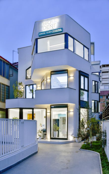
BIODENT-DENTAL CLINIC by. BGStudio
Embassy of Peace from Avatelier
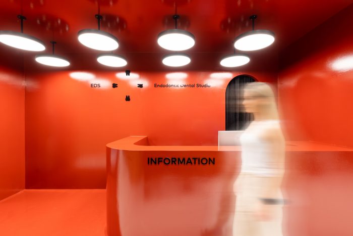
THE RED COLOR
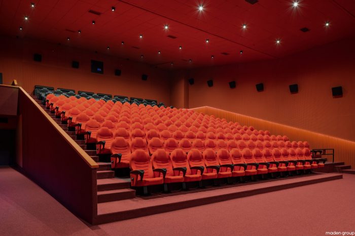
Red is the color that stimulates the most! In the color psychology it stands out as the strongest color that evokes passion, courage, love, blood and excites the mind! Its symbolism varies on different cultures such as luck and happiness in China, prosperity in Iran and even mourning in South Africa, but nonetheless the strength of its symbolism makes it the common color in 196 flags of the world.
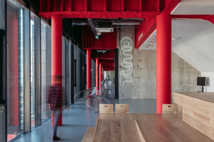
TUMO-in house architecture studio
Labeled as the "color of war" red ignites feelings of aggression and dominance, so it is suggested to use in small doses, to emphasize certain important design elements. Therefore often signals, or messages which contain a dose of danger often come through the color red!
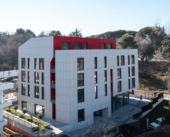
Endodontic Dental Studio from NOMMA Studio
In architecture, it is usually selected as a color to emphasize dominant elements, or even as a mean to storytelling that bring a bit of drama.
This is a very stimulating color and it is widely selected for project to stand out, here are some of the project we published at pikark.com:
Kino “Hyrije Hana” from Maden Group
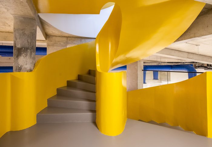
THE YELLOW COLOR
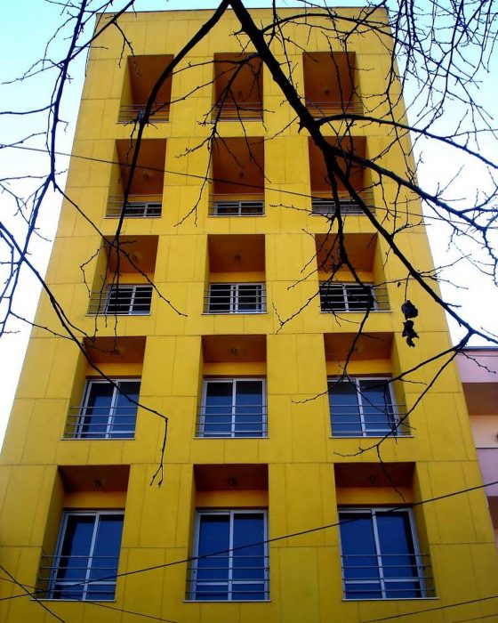
For those who visited or live in Tirana, would be impossible to have missed the Yellow building at the "Hoxha Tahsin" street. Beside its shape it is its birhg yellow color that makes it stand out!
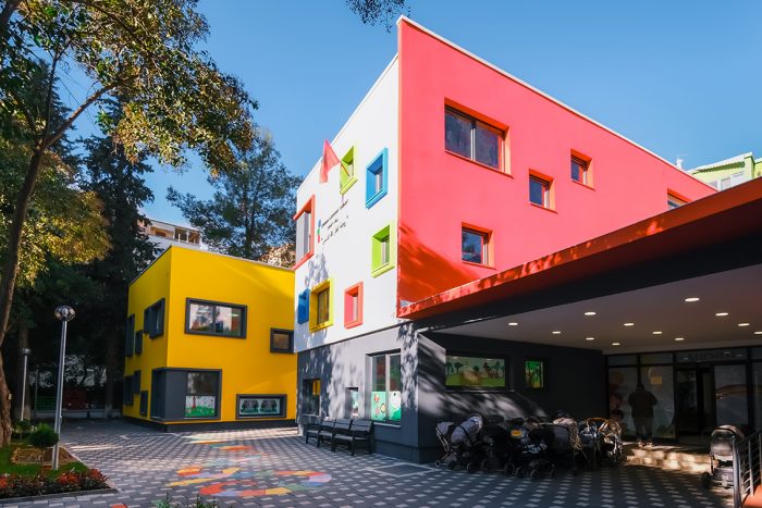
In the psychology of colors yellow expresses liveliness, optimism and joy and its use in architecture encourages people to be more cheerful and happy, promoting interaction between them! A color often used in projects for children such kindergardens: Montessori and Sunny Hill.
Montessori Kindergarden from SON engineering & construction
INTEGRATED KINDERGARTEN "SUNNY HILL" from ASARCHITECTS
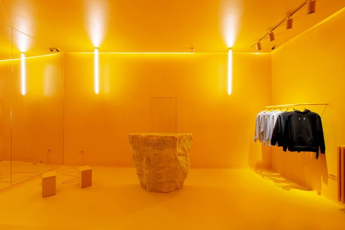
THE ORANGE COLOR
The color orange comes as a result of the marriage between red and yellow. Consequently, it reflects some of the features of both these colors such as liveliness and caution but not danger (like red). We may not often see it in architecture, but in the interior design the effect is noticeable by signifying strength and courage to the users, deep in their subconscious!
Pristine from ARTEC
UDV Architects Offices
THE BLUE COLOR
Blue is the color you find it everywhere! The color of the sky and the sea, brings us an immediate calm. The color it represents, optimism, confidence and self-confidence is often recognized as the most mysterious color of the whole spectrum of colors (probably given the depth of the oceans and the infinity of the sky. This is why it is used in important faith buildings like the Blue Mosque in Istanbul, to bring both the mysticism and the sense of serenity that the blue color of the sky evokes.
Sot do ju sjellim një projekt i cili do ju vendosni tërësisht në thellësinë e detit Jon!
Restaurant DETIJON from BGStudio
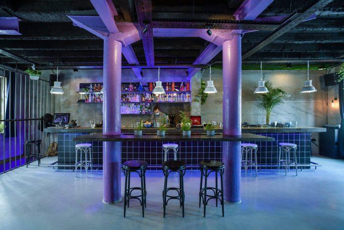
THE PURPLE COLOR
Probably on th least-used colors in building design, purple’s power to influence lies in its well-known association with royalty.
In color psychology, the color purple symbolizes luxury, royalty, nobility and wisdom. It’s also often associated with magic, mystery and the supernatural.
Precaucially used can add prestige and create a exclusive atmosphere. The project that we want to illustrate the use of purple in design is Servis Fantazia from Mur architecture.
Servis Fantazia from MUR Architecture
THE GREEN COLOR
Every color which is found in nature in abundance has a positive impact on our mood! With the green color could have not been different, as its presence brings only harmony and balance, making it the right color for offices and bedrooms!
The color green also carries responsibilities towards the environment, influencing human behavior at the moment we are in the presence of it. (Therefore a large part of the companies, organizations or design studios related to environmental sustainability usually implement the green color in their logo)
Usually designers select the green color to bring the feeling of nature, when its presence it is not possible. (Probably you have noticed these last years trends in interior design )
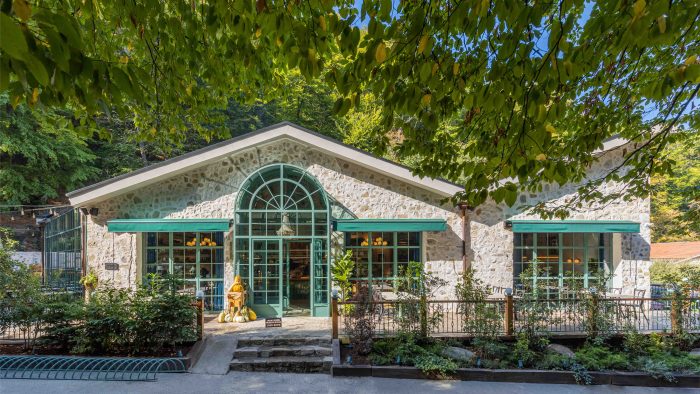
Soma Slow Food from Studio 11
Sera Bistro-Bar from BGStudio
THE PINK COLOR
When it comes to the color pink, immediately is acossiated with affection and femininity. This color itself symbolizes sincerity and playfulness.
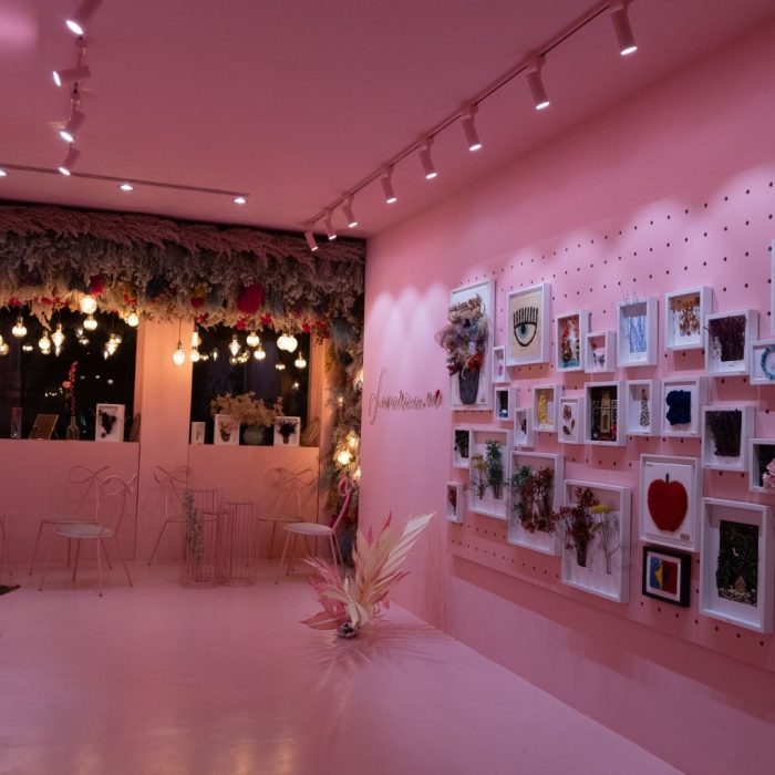
Beyond a feminine color, the color pink stimulates creativity and joy, creating a warm and friendly atmosphere, just like in the Lunaria.eu art cafe by Pana studio.
Lunariaa Art Cafe from Pana Studio
THE BLACK COLOR
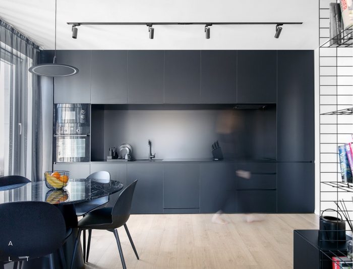
Black is the color of architects! Most likely because best seriousness, luxury and elegance, in a balanced way!
Often present in moderate doses, usually this color is linked to projects related to prestige, authority that calls for formality and respect.
Mostly used in interior design project when a sophisticated, elegant and mistyc atmosphere is aimed.
