Të dhëna mbi projektin
-
Studio
Klaudio Çurmaku
-
Faqja e Arkitektit
-
Tipologjia
Interior Design
-
Statusi
Completed
-
Photography
Leonit Ibrahimi
Përshkrimi
As the Italian designer Massimo Vignelli states, the main mission of a designer is to fight against the ugliness. However, when it comes to designing medical spaces, in addition to the ugly we have to face sensations like anxiety or fear. The contribution of architecture through the "decoration" of the interior in these typologies continues to be questionable, although various research groups such as Evidence-Based Design provide consistent evidence for a significant impact on how patients feel in various spaces.
The first thing that came to my mind when I took on the task of designing a dental clinic was that it should not look like a clinic. This principle in a way lies in the continuation of the humanization of hospitals after the awareness of the negative impact that the white premises with long corridors gave us.
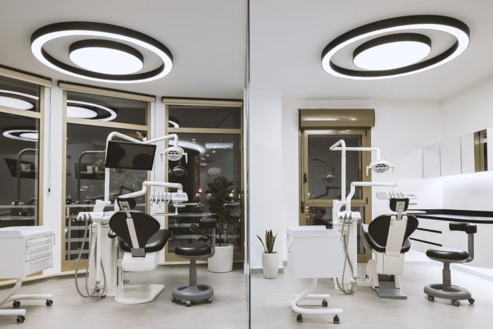
The clinic is located in a multifunctional building very close to the center of Tirana. The main advantage of this space was the view from the windows, which is a key factor in medical settings. Three dental chairs are placed near these windows and one which serves for check-ups, near the waiting area.
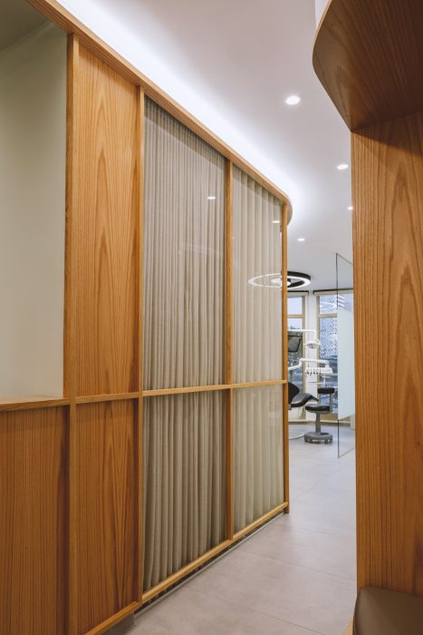
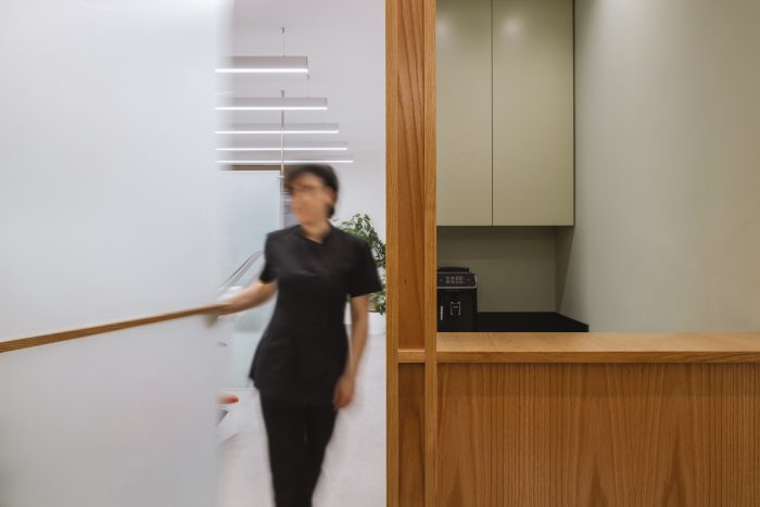
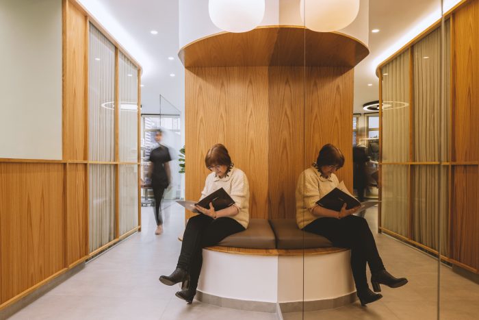
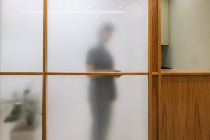
The waiting area consists of a row of chairs facing a wooden wall. A wooden slat positioned in the middle of the wall height starts as a decor, continues further as the door handle of one of the rooms, and then turns into the top of the reception counter.
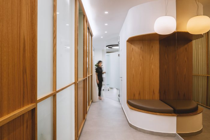
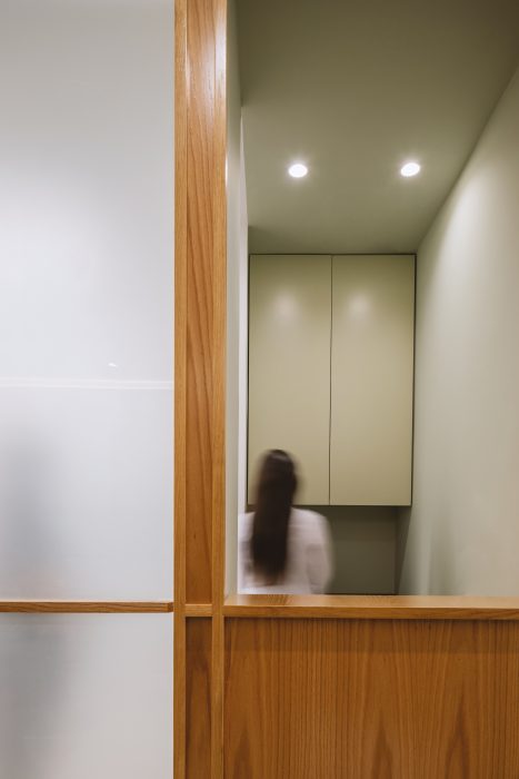
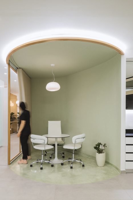
Maintaining a straight line, this horizontal line starts as decor and continues to perform other functions. It creates an interesting combination of warm wood, translucent glass with a mint hue, and two cavities, where one serves as a reception and the other, as consulting space.
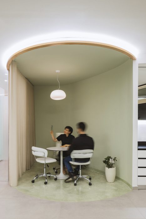
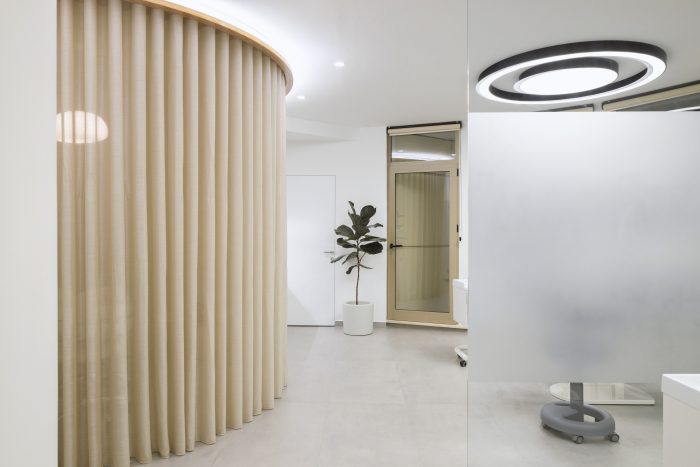
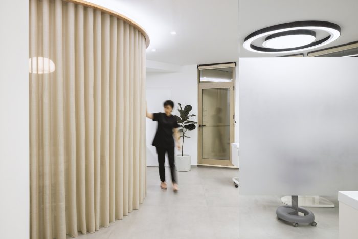
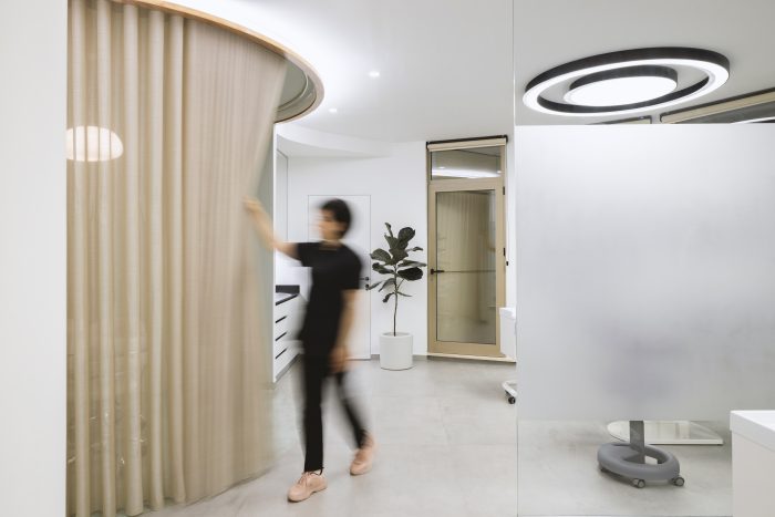
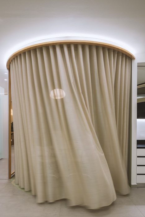
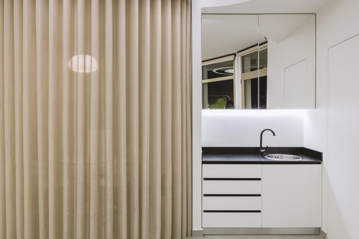
The front wall is covered with a mirror with a warm shade, enlarging the space virtually. The purpose of this inviting space was to provide tranquility which somehow reminds us of the calmness of Japanese temples. This wooden wall which closes with a curtained arch, a homely element, accompanies the patients to the treatment room.
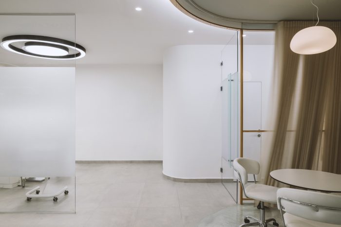
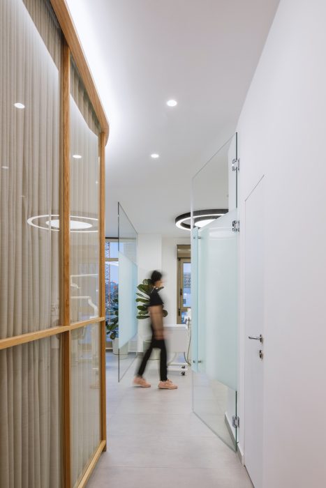
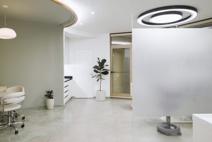
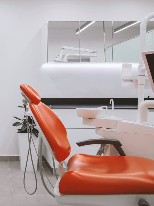
Meanwhile, the treatment rooms are much different, where whiteness and a full supply of natural light prevail. The contrast with the black color is given in some details like seats, lights, or counters.
The doors do not have straps to eliminate redundant details and there are also plants in every room, contributing to their soothing properties. Influenced by the shape of the existing space, which is located in the arch of the building, the circle is used as an element in the design, thus eliminating the strong corners and creating a more fluid continuity.

Vendndodhja
Tirana, Albania


 Shqip
Shqip
