
- Permbajtja
- prev
- next
- prev
- next
HIGHLIGHT : RICHARD ROGERS
Richard Rogers's creativity reveals the undisputed talent of an architecture that dares and does not hesitate to play with the limits of technology, to create a social architecture, which fosters human interaction, connection to the city and nature. His loss, last week shook the entire architecture community as because Rogers beyond representing key moments in the history of contemporary architecture, created profound social and political impact, returning social art as the epicentre of architecture!
At his presentations at the Harvard Design School of the Center Pompidou project, realized with his friend Renzo Piano, he emphasized the fact that architecture above all should create a joyful experience! And this is quite evident in most of his projects, where transparency, the play with volumes and the continuous relationship with public space and context prevail, always adding the human element as the main leitmotiv.
Architecture above all should create a joyful experience!
Which of the architects is not impressed by the Pompidou center in Paris?
Where the whole high-tech structure is legible on the façade and the colors show exactly the functions of the mechanical systems in sharp contrast to the order and "gray" of the existing Paris buildings. But when you are there, the dynamism of human movements both in horizontality and verticality together with transparency provide a human touch, turning it into the most lived urban space.
His projects demonstrate, an unique interpretation of the Modern Movement’s fascination with the building as machine, an interest in architectural clarity and transparency, the integration of public and private spaces, and a commitment to flexible floor plans that respond to the ever-changing demands of users, are recurring themes in his work.[1]
Beyond his genius, one of the main features of this architect, is the innovation that he has always shown in each of his projects, not being defined only by a sketch or his signature, has always shown his ability to be in coherence with the cultural and technological developments of the time.
Rogers combines his love of architecture with a profound knowledge of building materials and techniques. His fascination with technology is not merely for artistic effect, but more importantly, it is a clear echo of a building’s program and a means to make architecture more productive for those it serves. His championing of energy efficiency and sustainability has had a lasting effect on the profession.[2]
Life and education
Richard Rogers was born in Florence and studied architecture at the AA (Architectural Association) in London and later in Yale, in the United States. A great source of inspiration over time in the USA was also the American architect Frank Lloyd Wright, who researched and laid the foundations for generating a truly American architecture.
His work revolves around the importance of urban life and he believes in the potential of the city as a catalyst for social change, which his buildings over the years reflect.
Throghout his career he achieved international fame and many awards such as the prestigious RIBA Striling Award with the Barajas Airport project in Spain to the most important award in the field of architecture: Pritzker price, in 2007
Here we present you some of the most prominent works of his career :
Wimbledon House, London, UK(1969)
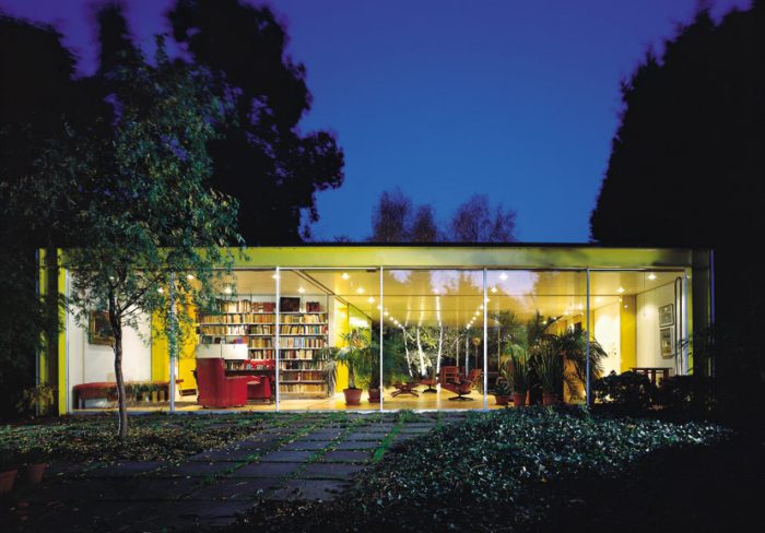 photo by Rogers Stirk Harbour + Partners LLP
One of the first projects Rogers realized when he was part of the TEAM 4, together with Su Brumwell (then Rogers wife) Wendy Cheesman and Norman Foster.
Among the first projects they realized was the home of Richard Rogers's parents in Wimbledon.
According to Rogers, the house was designed to show how pre-fabrication would enable fast and affordable housing construction.
The main aim of this project was to standardize the complete house building system in the UK. In fact, he did not succeed, but this project radically affected his entire professional journey in the next 50 years.
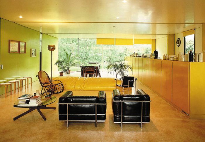 Courtesy of Rogers Stirk Harbour + Partners LLP
The house carefully balances the openness of shear glass facades with the need to provide his parents with privacy and seclusion - a task made harder by the building's location, just a short walk from Wimbledon Village in central London. Incorporated within the design is a separate flat and pottery studio which were positioned to provide a sound barrier between the house of the adjacent road. It is, essentially, "a transparent tube with solid boundary walls".[3]
Pompidou Center , Paris, France (1977)
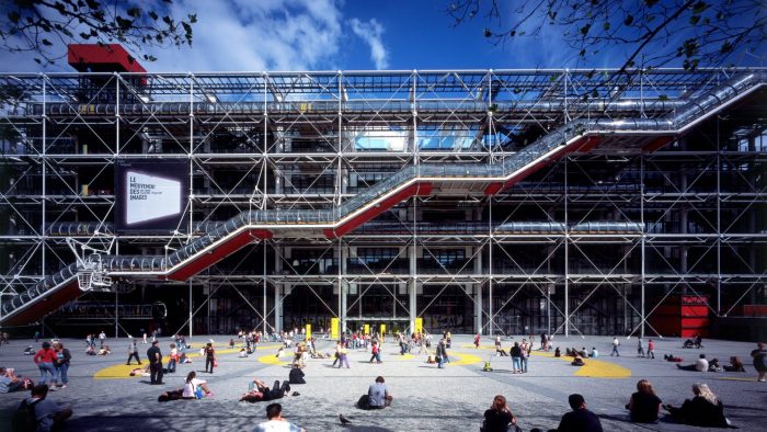 Courtesy of Rogers Stirk Harbour + Partners LLP
The Pompidou Center was the project that catapulted architects Richard Rogers and Renzo Piano at the center of the architecture world. This modern six-story museum, the so-called "fun palace" by Rogers himself, included in the program a large public library (a function that later changed) as well as a center for music and acoustic research.
A competition, that resulted in the first building of contemporary architecture, an example of inside-out architecture, where all the elements of the structure and mechanical are visible on the building’s exterior, leaving wide, open and flexible interior spaces. The adequate represantive of the high tech movement.
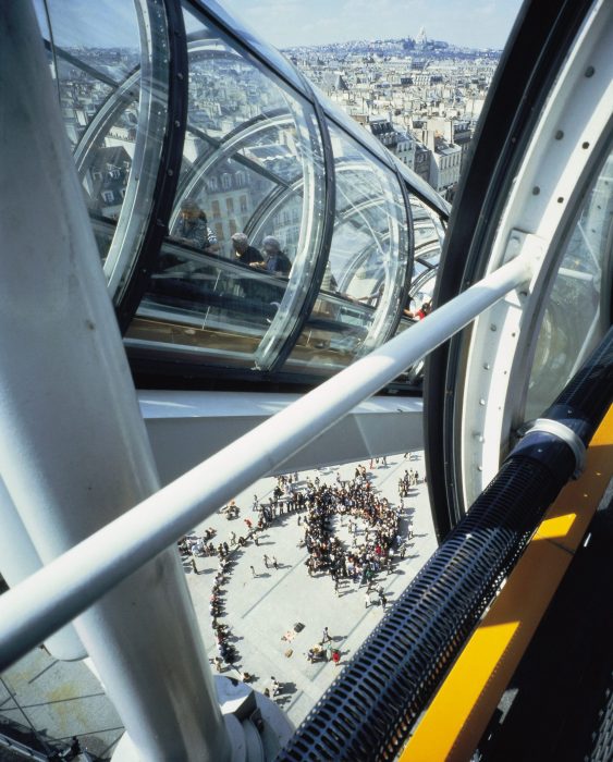 Photo by Richard Einzig, nga Rogers Stirk Harbor + Partners (RSHP)
Alongside the exposed structure, Centre Pompidou's facades are covered with colour-coded building services: blue marking its air-conditioning, yellow is for electrics, green denotes water pipes, and red highlights tubular escalators and elevators.[4]
Basically the special facade of the Pompidou center is the result of the composition of building elements themselves.
The Centre Georges Pompidou, designed in partnership with Renzo Piano, revolutionized museums, transforming what had once been elite monuments into popular places of social and cultural exchange, woven into the heart of the city.[5]
Lloyd’s insurance building in London.
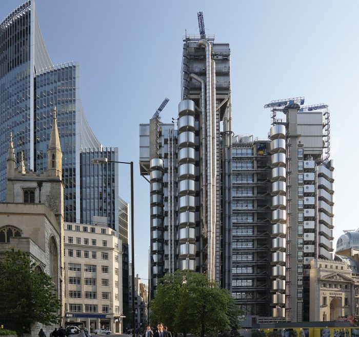 photo © User:Colin / Wikimedia Commons
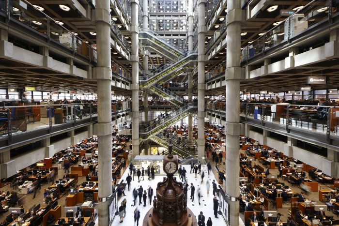
After the completion of Centre Pompidou in 1977 with Renzo Piano, Richard Rogers was commissioned to design a new building to replace the original Lloyd’s insurance building in London. The request was to create a building that would last to the next century and that would adapt to the changing needs.
 Imazhi nga Lloyd's
Richards Rogers and Renzo Piano won the as they proposed a building that could easily change its interior spaces according to the needs, by means of a series of galleries around a central space. To maximise space, services are banished to the perimeter. As the architectural form of the building evolved, particular attention was paid to its impact on the surrounding area, especially on the listed 19th century Leadenhall Market.
As a result, Lloyd’s became a complex grouping of towers, almost Gothic in feeling – an effect enhanced by the height of the external plant-room towers.[6]
Bordeaux law courts
The Bordeaux Law Courts was the winning project of the international competition for the design new law courts for the historic city of Bordeaux in 1992.
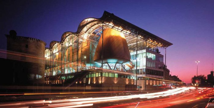
The design was for a building that would, through a feeling of transparency and openness, create a positive perception of the accessibility of the French judicial system. The brief was complex, requiring complete separation of public and judicial circulation. By pulling the building into its constituent parts, the resulting transparency encourages a sense of orientation, rendering an historically imposing institution more accessible.[7]
Key elements of the design include the creation of public space and integration with the existing urban landscape. Public entry to the building is via a flight of stairs placed to the side, leading to the ‘Salle des Pas Perdus’ at the core of the building, where lawyers, their clients and the public meet.
The seven courtroom pods are clad in cedar, raised on pilotis above the limestone plinth, within a great glass curtain beneath an undulating copper roof. The administrative offices are reached by bridges spanning the atrium – the clarity of the plan ensuring that different secure routes across the atrium are maintained both for the public and for magistrates. With its use of irregular forms and natural materials, the building successfully complements its sensitive environs, including a section of the city’s medieval wall.
Millennium Dome, London, UK

Commissioned to mark the beginning of the twenty-first century, the Millennium Dome was intended as a celebratory, emblematic and non-hierarchical structure that offered a vast, flexible space. The 100,000-square-metre (1.08 million-square-foot) adaptable space was suitable for the exhibition and performance events as well as any number of future uses. A high-profile project in its own right, the building also formed a key element of the masterplan by the Richard Rogers Partnership (RRP) for the future development of the entire Greenwich Peninsula.
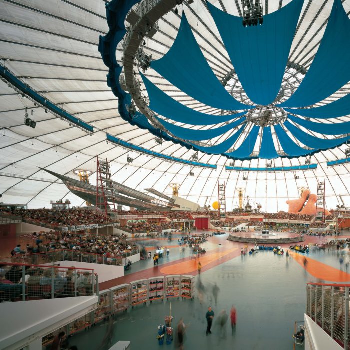
Built to house an exhibition celebrating the beginning of a new millennium called the Millennium Experience, the dome-shaped structure was designed as a giant tent. The 50-metre high dome in Greenwich, London, is supported from 12 bright yellow towers.
More than six million people visited the attraction in the year 2000, and it was subsequently converted into a concert and entertainment venue.[8]
Barajas Airport, Madrid, Spain
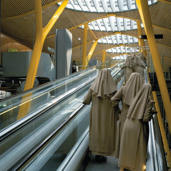 Photo by Rogers Stirk Harbour + Partners
The terminal, which is the biggest in Spain, was commissioned to enable Barajas International Airport to compete with major hub airports within Europe. The core building comprises a sequence of parallel spaces separated by a linear block allowing daylight to penetrate deep into the interior. The same form is applied to the satellite, which is comprised of two linear blocks, one for passport control and the other containing the gates.
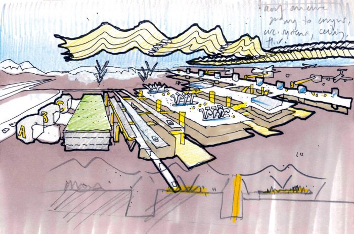 Sketch from Rogers Stirk Harbour + Partners 2014
The building is covered by a wave-shaped roof, supported on central ‘trees’ and punctuated by rooflights that provide carefully controlled natural light throughout the upper (departures) level of the terminal. The roof then oversails the edge of the building to shade the façades.
Given the multi-level section, a strategy was required to bring natural light down into the lower levels. The solution is a series of light-filled ‘canyons’ that separate the parallel slices of space to the various stages of transit, from the arrival point to check-in, security and passport control, then on to departure lounges and finally to the aircraft.
Barajas Airport project, was also the project that won the RIBA Stirling Prize in 2006.
Heathrow Terminal 5, London, UK
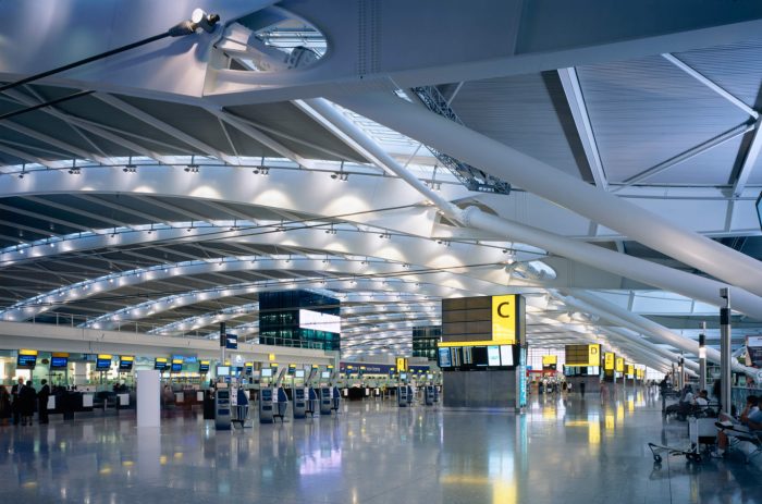 Photo Rogers Stirk Harbour + Partners 2014
Rogers Stirk Harbour + Partners won the competition for Terminal 5 (T5) at Heathrow Airport in 1989. The terminal became operational in March 2008, after being officially opened by Queen Elizabeth II.
The built scheme for the main terminal offers an unencumbered, long-span ‘envelope’ – developed with Arup – with a flexibility of internal space conceptually similar to that of the practice’s much earlier design for the Pompidou Centre in Paris. Departure and arrivals areas, check-in desks, commercial space, retail, offices, passenger lounges, back-up and other facilities are all contained within freestanding steel-framed structures inside the building and can be dismantled and reconfigured as future needs change.
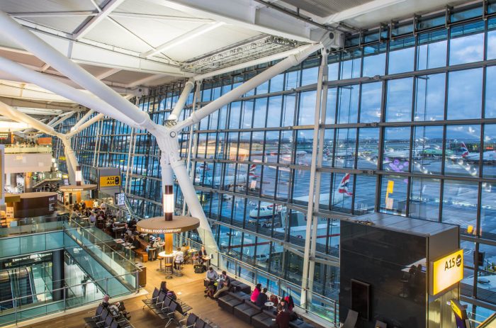 Photo by Rogers Stirk Harbour + Partners
The built, multi-level scheme is contained beneath an elegant, curved floating roof, supported by slim columns at the perimeter edges to provide the required highly flexible and visually dramatic internal space. In this scheme, passengers depart and arrive in a terminal building which offers generous spaces and fine views across the airport.
The Leadenhall Building
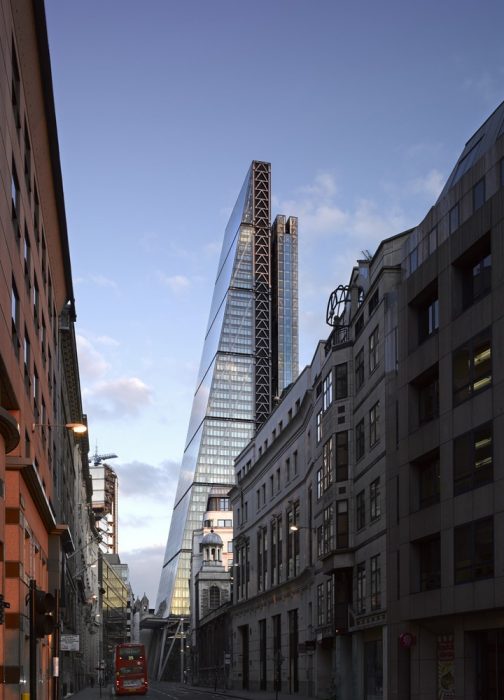
This 50-storey tower opposite Lloyd’s of London rises to a height of 224.5 metres (802 feet), its slender form creating its own distinctive profile within an emerging cluster of tall buildings in this part of the City of London. The building’s tapering profile is prompted by a requirement to respect views of St Paul’s Cathedral, in particular from Fleet Street. The tower’s design ensures that from this key vantage point the cathedral’s dome is still framed by a clear expanse of sky.
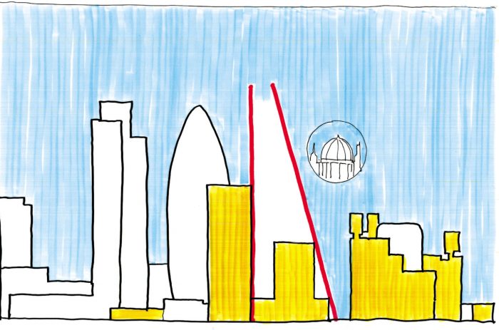 Sketch from Rogers Stirk Harbour + Partners
The building comprises a number of distinct architectural elements that provide clarity to the composition both as a whole and as a legible expression of its constituent parts. These elements include the primary stability structure, the ladder frame, the office floor plates, the northern support core, the external envelope and the public realm.[9]
The office floors are designed to meet the highest quality office space standards taking the form of rectangular floor plates which progressively diminish in depth towards the apex. Instead of a traditional central core providing structural stability, the building employs a full perimeter braced tube which defines the edge of the office floor plates and creates stability under wind loads.
© Richard Bryant
The circulation and servicing core is located in a detached north-facing tower, containing colour-coded passenger and goods lifts, service risers and on-floor plant and toilets.
The building’s envelope expresses the diversity of what it encloses, reinforcing the composition and providing legibility to the primary elements. Although the tower occupies the entire site, the scheme delivers an unprecedented allocation of public space – the lower levels are recessed on a raking diagonal to create a spectacular, sun-lit seven-storey high space complete with shops, and public space.
Macallan New Distillery and Visitors Experience building
 ©Joas Souza
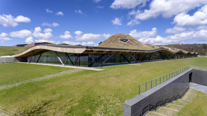
The Macallan is already established as one of the most famous whisky makers in the world and wanted a new centre that could reveal the production processes and welcome visitors while remaining sensitive to the beautiful surrounding countryside.
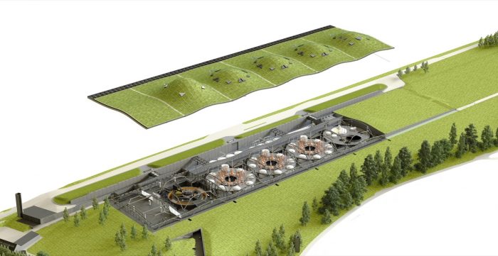 Rogers Stirk Harbour + Partners courtesy
The new building provides a facility capable of increased production and also allows for easy expansion in years to come. Production cells positioned into a open plan reveal all the whiskey making process all at once. Activities in the plan is also reflected into the ceiling, where a gently undulated roof rises and falls as to signal the activates beneath. A movement that recalls the ancient Scottish earthworks.
.
[1] https://www.pritzkerprize.com/laureates/2007
[2] https://www.pritzkerprize.com/laureates/2007
[4] -https://www.dezeen.com/2019/11/05/centre-pompidou-piano-rogers-high-tech-architecture/
[5] https://www.pritzkerprize.com/laureates/2007
[6] https://www.rsh-p.com/projects/office/lloyds-of-london/
[7] https://www.rsh-p.com/projects/civic/bordeaux-law-courts/
[8] https://www.rsh-p.com/projects/culture-and-leisure/the-millennium-dome/
[9]https://www.rsh-p.com/projects/office/the-leadenhall-building/