
- Permbajtja
- prev
- next
- prev
- next
In the modern age of sensationalism, consumerism, and widespread fake news, it's easy to understand why we feel the need to express ourselves through memes—the abstract photographs, video clips, and gifs that are manipulated in various ways to express thoughts on certain matters or situations that are relatable to people across the globe. Memes often expound complex yet concise sentiments which, in a way, closely resemble the way that we communicate in real life. 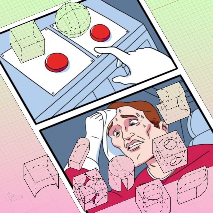 In the world of architecture, communication is often represented through critical essays, stunning renders and photographs, and hand-drawn analytical diagrams. In fact, architecture communication as we know it has mostly been a literal representation of the thing itself: Ideas are translated into plans, sections, elevations, details, form diagrams. But with the rise of memes and abstract expressions, why aren’t we popularizing our own personal thoughts with this form of widespread social media?
 In the world of architecture, communication is often represented through critical essays, stunning renders and photographs, and hand-drawn analytical diagrams. In fact, architecture communication as we know it has mostly been a literal representation of the thing itself: Ideas are translated into plans, sections, elevations, details, form diagrams. But with the rise of memes and abstract expressions, why aren’t we popularizing our own personal thoughts with this form of widespread social media?
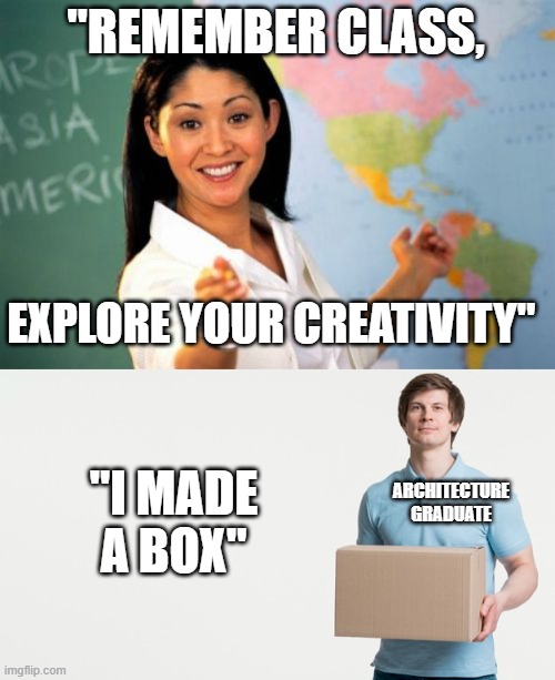
Below we present the two most viral comparisons on the internet. It is about "Dubai Expo 2020" by Foster + Partners which is compared to a figdet spinner. Another building is the "Karaburma Tower" in Belgrade which is compared to the famous Toblerone chocolate.
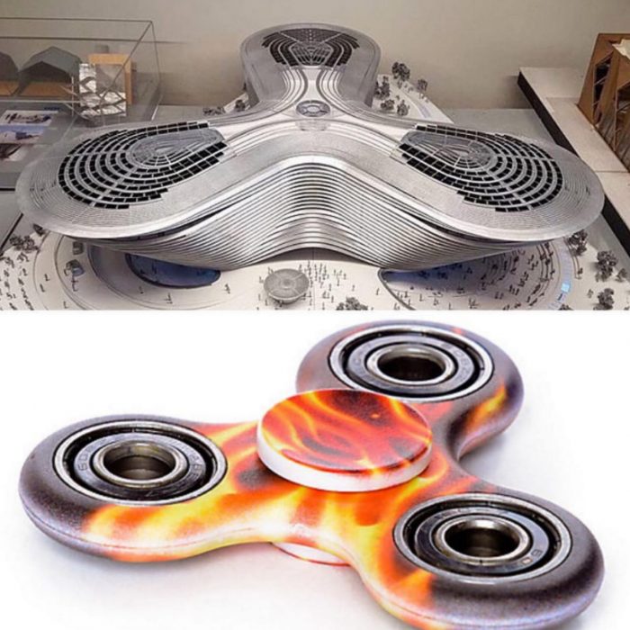
"Dubai Expo 2020"
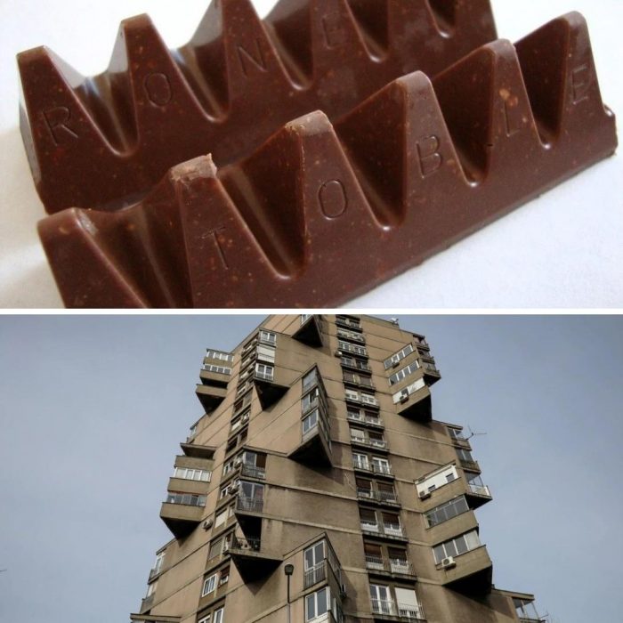
"Karaburma Tower"
Maybe it is time that we, as a community of designers, enter the 21st century, conform to the mainstream way we can share ideas, and transform our thoughts on design into memes. If memes have the power to turn ordinary scenes from SpongeBob SquarePants into a worldwide conversation starter, then they could easily bring digital architecture to a new platform 'oR aRe We JuSt SpEnDiNg ToO mUcH tImE tHiNkInG aBoUt MeMeS'?!

 Shqip
Shqip