Të dhëna mbi projektin
-
Studio
Minimal20 Studio
-
Faqja e Studio
-
Tipologjia
Residential Architecture
-
Statusi
Completed
-
Viti i ndërtimit
2021
Përshkrimi
"VIR House" renovation concept started few months ago as the building was very old and not accomplishing some of the basic functions of a real house. The family of four that owns the house, wanted to have a boutique shop in the ground floor and a two bedroom apartment in the first floor. Our challenge was divided in two directions:
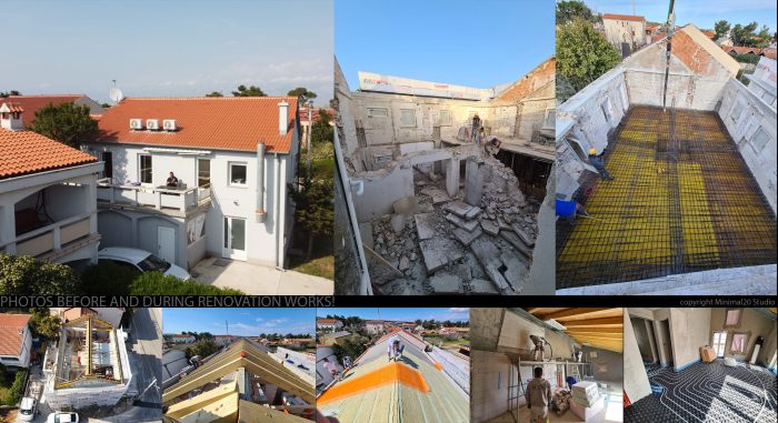
During renovation
First, the general construction was made of very wide stone walls 50-80 cm, but the floors were very weak and the roof very old. So we needed to find a good solution of what we would save from the first construction and what we needed to add, in order that the new house would be safe and strong and not risk a possible demolition in the future. Also we needed to think of a new exterior design for the building.
Second, the ground floor was used as a shop for small beach equipment and accessories and the upper floor was made of 3 small studio apartments, in which the dividing walls were also wide 60-80 cm and made of big stones. Our second challenge was to create new spaces for both floors and have a totally new interior design, providing comfortable living, but also modern minimalistic solutions.
After we carefully studied the old house, we decided to demolish a very big part of it, including the floors, the old roof and also create a new underground basement at the place where before was a big water deposit of the house, which did not have even proper water canalisation or city water connection. Basically only the outside walls were conserved and not touched from the old house. After that, we decided to strengthen them, by adding small concrete columns in few positions and also a big one in the middle of the plan.
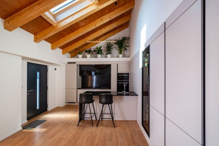
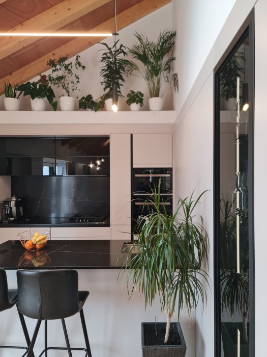
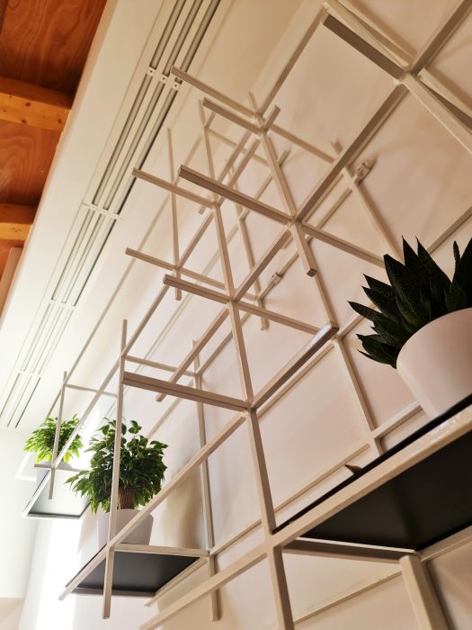
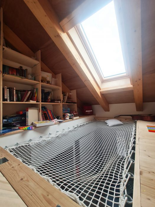
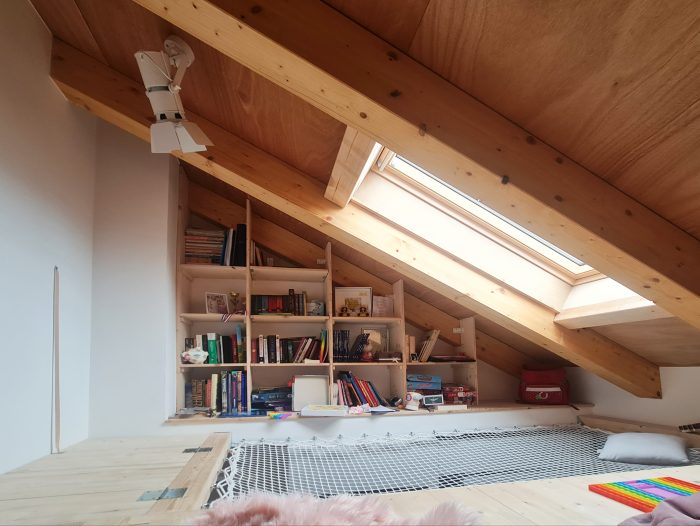
A very particular feature of the new house was the roof. We decided not to build a second floor, but to leave the new roof totally visible and be part of the interior design of the apartment.
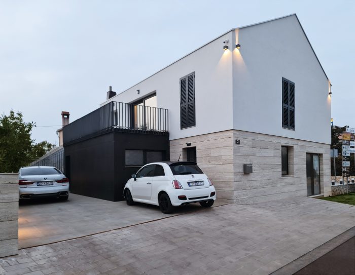
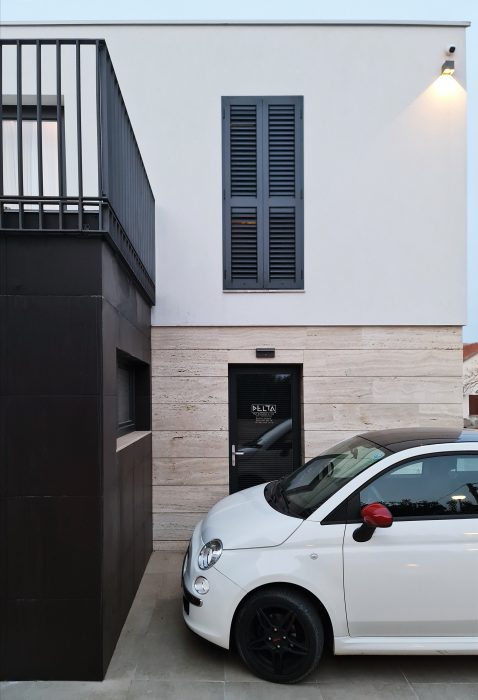
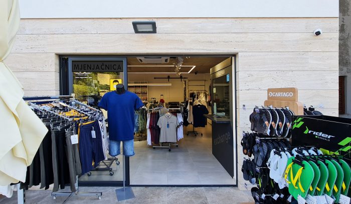
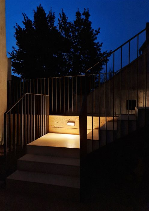
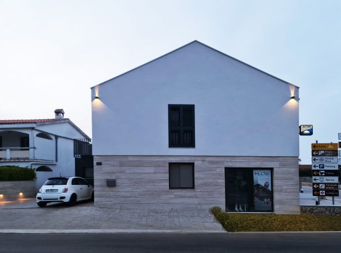
The roof became very important part of the interior design, but also for the exterior. The outside walls go up until they reach the ending line of the roof tiles, making possible that from down street view, you can not see them and the house looks like it is in a triangular shape from its two sides, one of which faces the main road. The facade is made of travertine stone tiles in the ground floor and from simple white plaster in the upper floor. There is also a small volume that goes outside the regular shape of the house and its facade is covered in black matt tiles, followed by vertical anthracite railings that surround the terrace of the apartment.
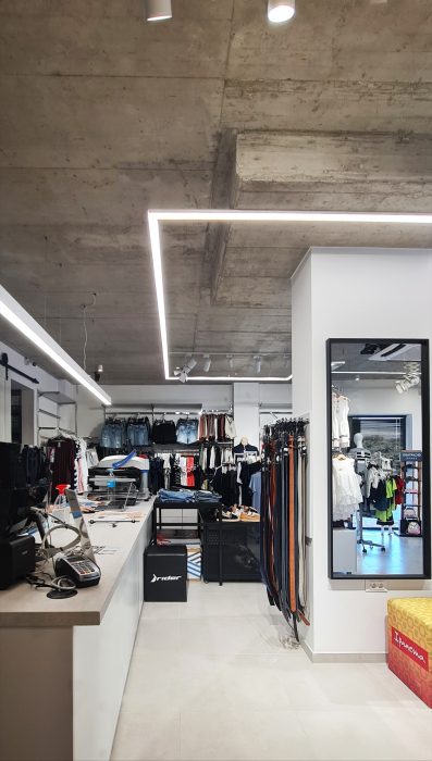
When we designed the interior of the shop in the ground floor, the image of the final design was very clear in our minds : raw concrete ceiling with white walls and black/anthracite elements in windows, lights and furniture. The apartment interior design was our biggest challenge.
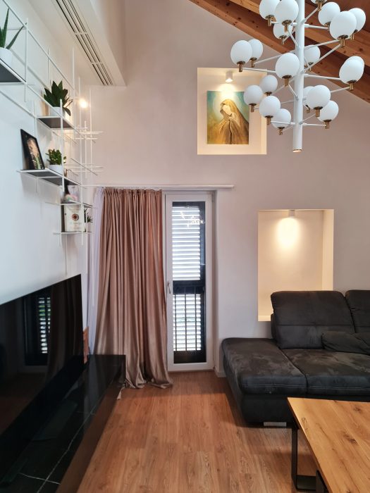
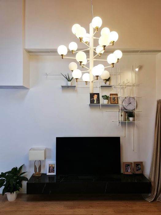
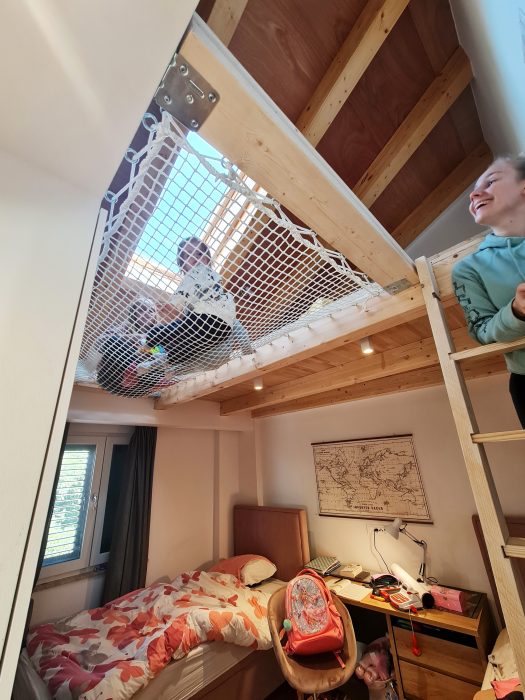
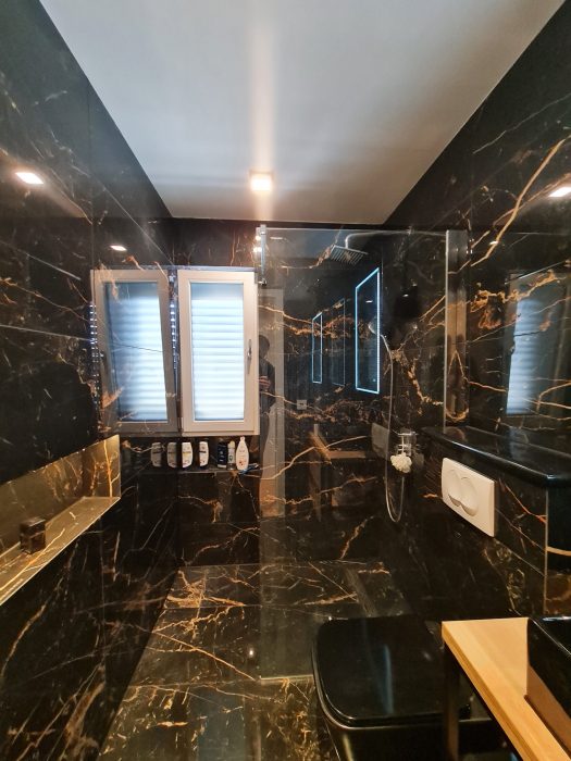
It had one main living space where the kitchen, the dining area and the living room were all together gathered, one main bedroom with a bathroom inside, one small room and a main bathroom. In all rooms the wooden roof was uncovered and seen as a main feature in the design.
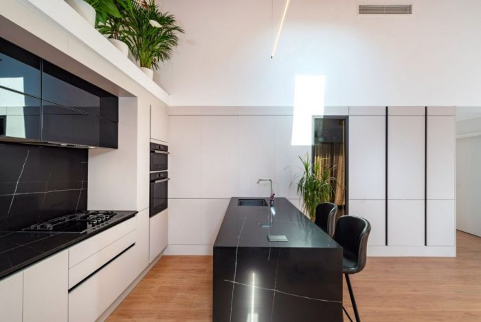
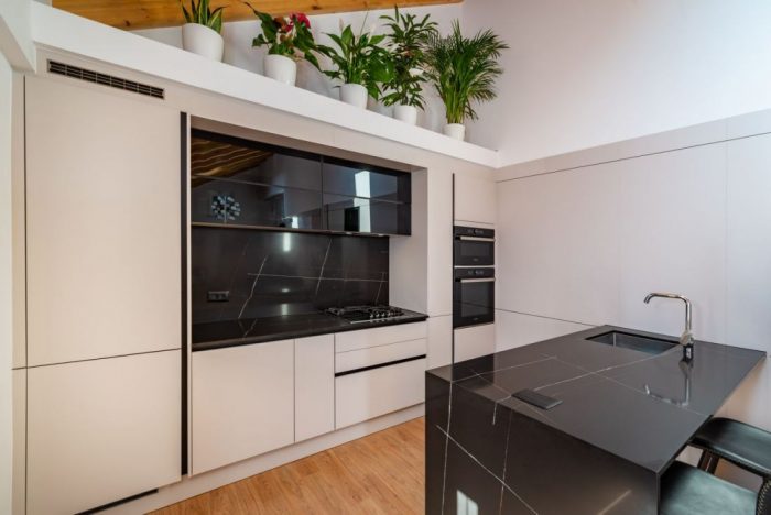
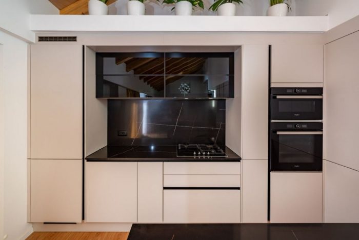
The second main feature was the kitchen, which had a very important position in the plan and also was the first element you could see after you enter the house. The problem was that it was a small one. The place was only 3.5 meters wide and for us that was not enough, not just functionally, but also aesthetically. The solution that we found, was concentrated in making the kitchen look bigger visually, so we decided to cover the next wall of the kitchen with the same coloured panels as the kitchen doors and also connect it with a recessed small space, which was planned to serve as a closet. An island part was also added to the general design, in order to have more cabinets and more functional space for the cooking and cleaning process.
An important matter in the interior was also the natural light and for that a big sliding stained glass window connects the apartment with the big terrace outside of it. Also two roof skylights are positioned up, one in the living space and one in the kitchen part, providing more light for the whole living room. The apartment has only 90m² but the roof design and the kitchen solution create an optical illusion and make it visually look much bigger in all its space.
This renovation project was for us a very successful achievement, not only because of a very well planned project, but also because of a strong collaboration with professional partners like Delta Group d.o.o and Nolte Studio, both located in the city of Zadar.
Vendndodhja
Croatia


 Shqip
Shqip