- Permbajtja
- prev
- next
- prev
- next
Colour of the year in Pantone Colours system
What are Pantone colours?
When people talk about Pantone colors, usually they're referring to the color specified in the Pantone Matching System (PMS). This is a proprietary, standardized color system used across many industries in manufacturing, which describes colors by an allocated number. The Pantone system is the standard language for color communication from designer to manufacturer to retailer to customer. The word “Pantone” comes from the company that invented the system, Pantone Inc.
How Do Pantone Colours Work?
The Pantone Matching System standardizes 1,114 colors and assigns each color a number and name. By using the Pantone system, people in different locations can refer to the same color by knowing only the number that identifies it. This helps manufacturers and others to avoid mistakes like color deviation. As long as a factory has the right Pantone number for the color of your product, they can be sure about whether or not the color will match your specification.
What is the colour of the year in Pantone Colours?
The 2023 Pantone color of the year has officially been announced and it is luxurious! Viva Magenta 18-1750, packs a powerful punch. It’s a vivid, sensual, and joyous color leading us into 2023. With recent logo redesigns from top brands like Instagram and Baskin Robins, we’ve already seen this warm color play out in branding. Viva Magenta is an exuberant, and playful red. Pantone describes Viva Magenta as powerful and empowering, encouraging the freedom of self-expression and experimentation. 2023 is the year we sink our teeth into life and expand our horizons. Whether you’ve finally started that business you’ve always wanted to, or pushed yourself out of your comfort zone in another way Viva Magenta is a celebration of the life you’re creating with yourself.
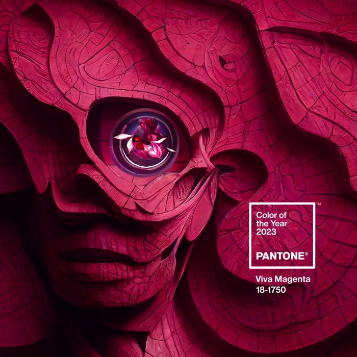
Pantone 2023 color of the year color combinations
Looking for colors to pair with Viva Magenta? This vibrant Pantone red pairs well with deep jewel tones like emerald green and navy blue, as well as pops of neon.
Let’s take a look at some color combinations with Viva Magenta.
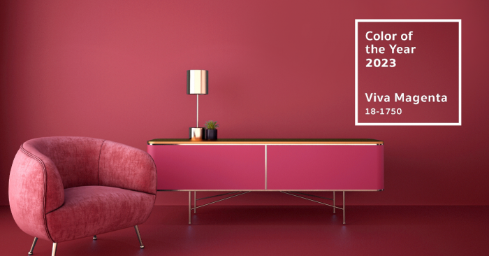
Viva Magenta in a monochrome color palette
Popular cookware brand, Great Jones, uses Pantone’s 2023 color of the year in a monochromatic color palette. Pair Viva Magenta with other pinks and reds to create a rich and delightful aesthetic. You can create contrast by using lighter tones. This will help create a visual hierarchy.
Viva Magenta with a hint of neon
This year’s Pantone color is vivacious. Why not lean into that and build a bold color palette by pairing it with neon colors? Here we see a non-alcoholic wine alternative, Proxies, layering Magenta with a bright neon yellow. The result is eye-catching but still grounded with this soft, muted beige.
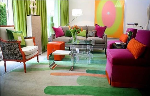
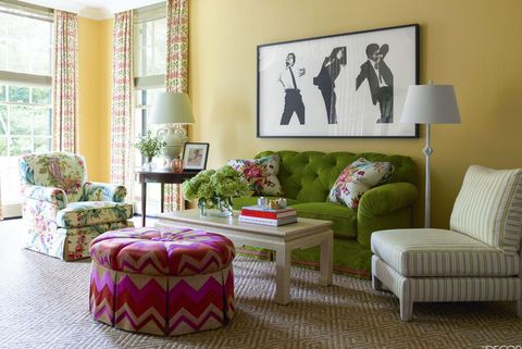
Viva Magenta with earthy hues
You can soften Viva Magenta by pairing it with muted earthy hues like sandy beige and cinnamon brown. Viva Magenta can be made soft and romantic by pairing it with monochromatic pink colors. We love the flexibility of this color and the impact it makes no matter what it’s paired with!
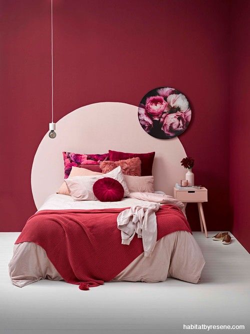
Five interiors tickled pink with Color of the Year Viva Magenta
Shoreline Waikiki, Hawaii, by BHDM
The interior of the beachside Shoreline Waikiki hotel in Hawaii has a flamboyant colour scheme. Redesigned by US studio BHDM for the "millennial-minded traveller", the accommodation has a hot-pink carpet that stretches from the reception to the ground floor lounge and contrasts the brightly coloured yellow, teal, blue and red furniture upholstery.
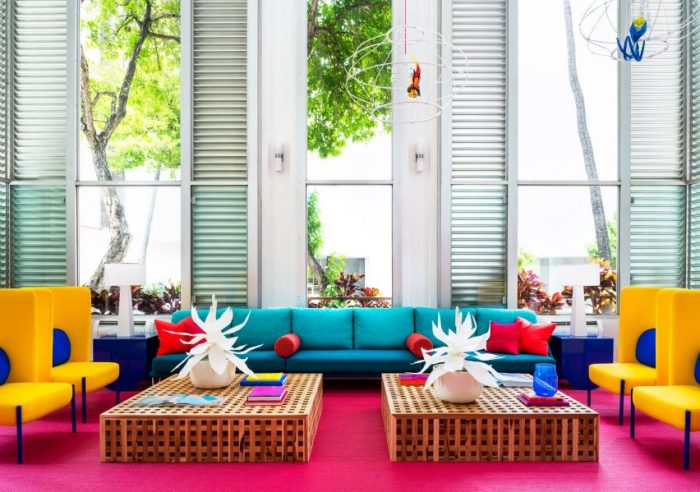
Photo is courtesy of BHDM
Atrium, US, by Smith Hanes Studio
Rich tones of green, raspberry and gold collide with smooth terrazzo, shiny tiles and tropical wallpaper in Atlanta bistro and restaurant Atrium.
Local architecture studio Smith Hanes Studio looked to the lines, patterns and shapes found in colourful French cafes and art deco buildings for the space, which is filled with an array of large leafy plants.

Photo is by Tim Lenz
Maggie's Centre, UK, by Ab Rogers Design
At this Maggie's Centre cancer treatment site in Sutton, England, patients can rest and convalesce in a pinky-purple-toned living area that studio Ab Rogers Design wanted to feel cheerful, yet sensitive. "Believing in colour's sensual and psychological power, we coloured the surrounding rooms to suit the functions and activities they host," said Ab Rogers Design.
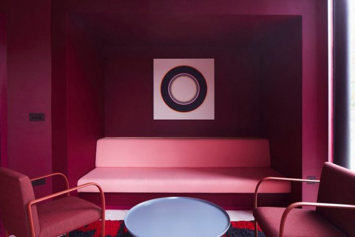
Photo is by John Short
Toggle Hotel, Japan, by Klein Dytham Architecture
Sandwiched between a raised expressway, a railway line and Tokyo's Kanda River, Toggle Hotel was designed by Klein Dytham Architecture to stand out from the neighbouring infrastructure. Inside each of the rooms, which guests are able to choose based on their colour preferences, the furniture, bedding, carpets and soft furnishings are all coloured in the same shade.
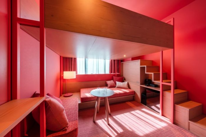
Photo is by Shingo Nakashima
Resa San Mamés , Spain, by Masquespacio
Valencia-based studio Masquespacio injected splashes of its signature colour-blocking style throughout Resa San Mamés, in Bilbao, Spain.
In the main lobby, millennial pink paint clashes with the crimson tiles that line the walls, while soft furnishings and partitions were used to define zones elsewhere on the ground floor.
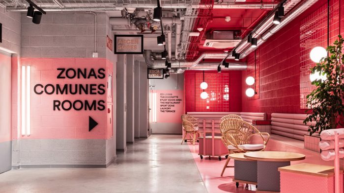
Photo is by Masquespacio

 Shqip
Shqip