
- Permbajtja
- prev
- next
- prev
- next
Early life
Farshid Moussavi (born in 1965, Shiraz, Iran) is an Iranian-born British architect, educator, and author. She is the founder of Farshid Moussavi Architecture (FMA) and a Professor in Practice of Architecture at Harvard University Graduate School of Design. Before forming FMA, she was co-founder of the London-based Foreign Office Architects or FOA (1993-2011), recognised as one of the world's most creative design firms, integrating architecture, urban design, and landscape architecture in a wide range of projects internationally. Moussavi was elected a Royal Academician in 2015, and subsequently, Professor of Architecture at the RA Schools in 2017. She was appointed Officer of the Order of the British Empire (OBE) in the 2018 Queen's Birthday Honours for Services to Architecture.
Early life and education
Moussavi was born in 1965 in Shiraz, Iran and immigrated to London in 1979 to attend boarding school. She trained in architecture at the Dundee School of Architecture, University of Dundee, The Bartlett School of Architecture, University College London and graduated with a Masters in Architecture (MArch II) from the Harvard University Graduate School of Design (GSD). While at the Harvard, Moussavi met architect Alejandro Zaera-Polo.
Career
Moussavi first came to prominence with Foreign Office Architects (FOA), the practice she co-founded in 1993 with her ex-husband Alejandro Zaera-Polo.[7] At FOA, Moussavi co-authored the design for the award-winning Yokohama International Ferry Terminal in Japan (which was subject to an international design competition in 1995) and was part of the United Architects team who were finalists in the Ground Zero competition. She also completed a wide range of international projects including the John Lewis complex in Leicester, England and the Meydan retail complex in Istanbul, Turkey.
In June 2011 after splitting with Zaera-Polo, Moussavi re-established her own London-based practice, Farshid Moussavi Architecture (FMA).[7] Her notable projects with FMA include the Museum of Contemporary Art Cleveland, Victoria Beckham's Flagship Store in London, a residential complex in the La Défense-Nanterre district of Paris, a multi-story residential building in Montpellier, and the Harrods Toys Department in London. The practice is currently working on a number of high-profile projects including an office tower for the City of London. It was a finalist for London National Portrait Gallery competition, and joint winner of the international competition for the new headquarters of the International Olympic Committee (IOC) in Lausanne.
Research
Alongside her professional practice, Moussavi has held a longstanding commitment to research across the academic and professional field of architecture. Since 2005, she has been Professor in Practice at Harvard University Graduate School of Design.[3] Previously, Moussavi taught at the Architectural Association in London for eight years (1993–2000), and was subsequently appointed as Head of the Academy of Fine Arts in Vienna (2002–2005). She has been a visiting professor of architecture at the Berlage Institute in Rotterdam, the Hoger Architectuur Instituut Sint-Lucas in Gent, and in the US, at UCLA, Columbia University and Princeton University.
Moussavi's research, which began while teaching at the Architectural Association in the early 90s, has focused on instruments that allow architects to embed built forms with design intelligence and creative possibilities – such as the diagram, information technology, new construction technologies, envelopes and tessellation – and how they can be used to develop alternative concepts for the practice of architecture.
Publishing
Moussavi has published three books: The Function of Ornament, The Function of Form and The Function of Style in conjunction with her teaching at Harvard, all of which disclaim architecture's traditional binary oppositions – form vs.function, structure vs. form, ornament vs. function, style vs. function – proposing that architecture's creative potential lies, rather, in finding ways to relate them to one other.
Most famous projects
Harrods Toys Departement
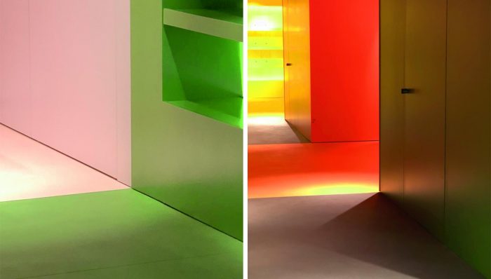
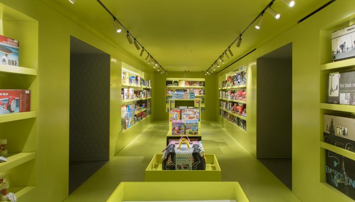
This toy department boasts a heritage richer than most, dating back to the 1880s, an era when hand-carved rocking horses, wind-up animals and fully functioning miniature steam trains topped Christmas lists. ‘It’s lovely that Harrods is so deeply rooted in history,’ says Moussavi, ‘but the design has always evolved over time; it’s not static. [Harrods] has remained as a key player because it’s committed to innovation.’
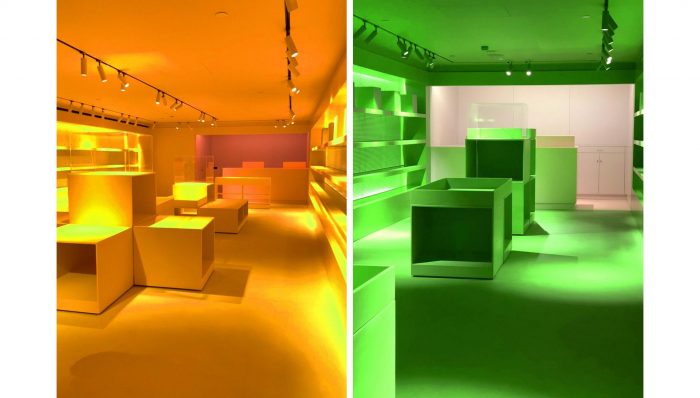
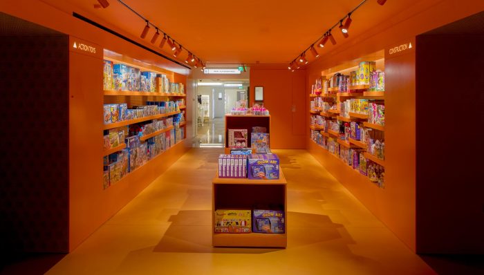
One source of inspiration for Moussavi was ‘tunnel books’, 3D pop-up dioramas popular during the Victorian era. With these in mind, a ‘tapered tunnel’ runs down the centre of the toy department, with ‘transitional moments’ occurring as visitors move between each coloured room; an optical play on perspective, colour and material. ‘I’m still quite amazed they went for this because it is pretty radical,’ she says.
The design eschews conventional wisdom on department store layouts, which dictates a large open space with a stockroom at one end. Instead, each colour-coded room is divided by cleverly integrated ‘mini stockrooms’. ‘When a store is large, it needs to break down into different kinds of experiences, otherwise it becomes monotonous,’ says Moussavi.
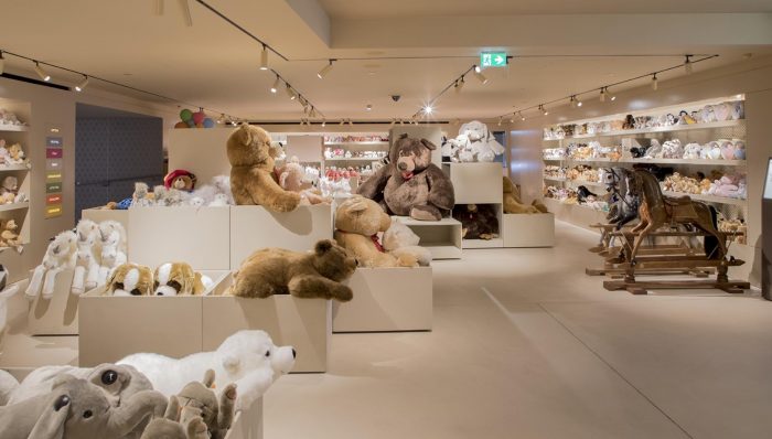
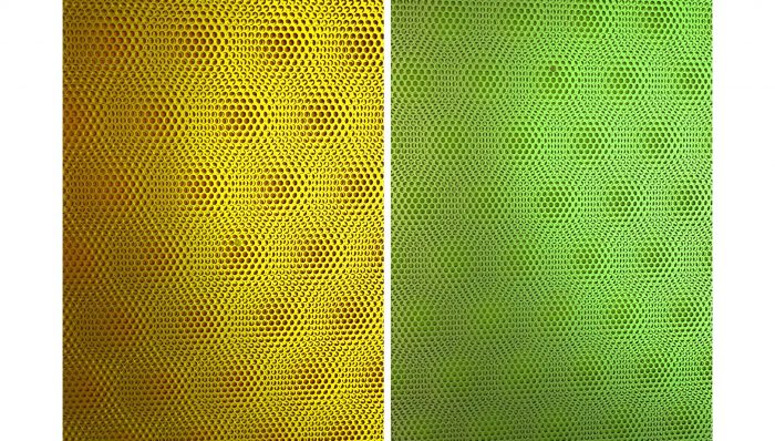
Another convention the team has deliberately defied is gender division. ‘Normally you go to a toy department and see pink and blue,’ explains Moussavi, but here colour is presented as a spectrum, rather than a duality, prompting shoppers to subconsciously open their minds.
Victoria Beckham Store, London
The design aims to provide the sense of transience, unpredictability and exploration that underpins fashion itself. A concrete door, cast as a negative of one of the windows of the Georgian façade above, slides open to give access to three floors within. Responding to the growth of online shopping, which allows fashion brands to provide customers with choice, the spatial experience of the Victoria Beckham store is designed to be less like a market – where the focus is on choice – and more like a gallery where the focus is on display.
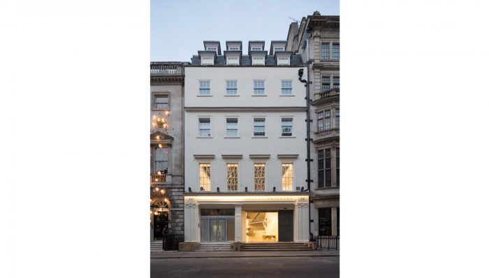
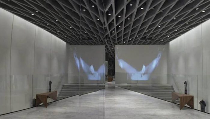
Inside spatial devices such as a wide concrete stair, cutaway floor and cast-lattice coffered ceiling invite the customer to explore the space and, through their dynamic forms, correspond to the fast-changing pace of fashion. Large triangular cuts in the first and second floors provide views up through the entire volume, drawing the eye towards the oblique geometry of the coffered ceiling. Reflective stainless steel ceilings on the lower two floors create an optical doubling effect, making the store space seem twice as high and, by doubling the stair on itself, turning the staircase into a space of its own where the store can host different events, shows and displays.
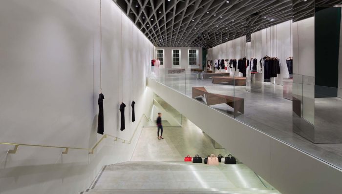
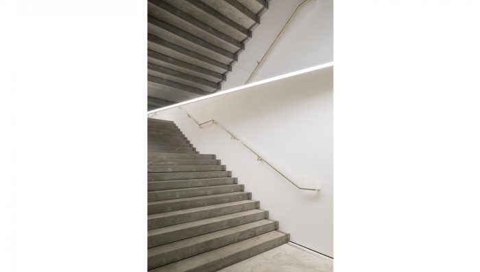
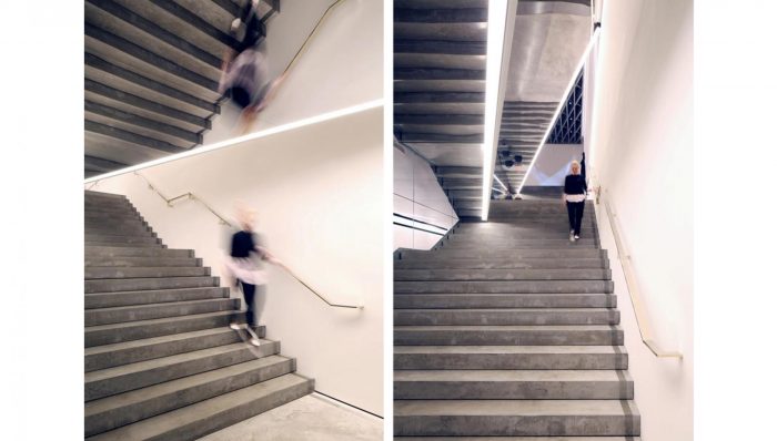
The coffered ceiling, which has long been used in modern art galleries to hide services or deaden sound though its depth, is used on the top floor to conceal the mechanical and electrical system. Its complex form, cast in grey concrete, contains a system of tracks from which steel chains are hung to support garments. The chains, replacing the conventional system of clothes rails, are one of a number of active elements that turn conventional shop fitting into a series of sculptural pieces. Individual items of clothing are suspended from each vertically hanging chain to provide a soft lining to the wall that can be moved around the space or removed entirely to turn the store into an event space.
Ravensbourne College, London
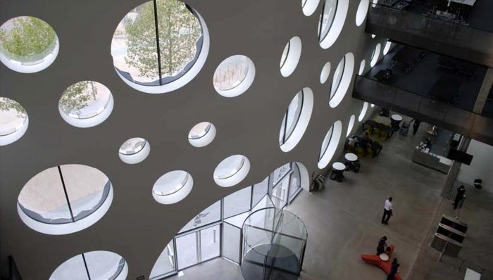
The open studio learning environment is laid out on split floors arranged around a stepped atrium in which the vertical circulation is located to allow for visual and physical communication between the college’s departments. The stepped atrium also provides the college with a lower atrium, rising from the ground to the 3rd floor, in which publicly accessible events can be held, and an upper atrium that is used by the college only for informal gatherings, inter-departmental events, colloquiums, workshops as well as large lectures. This variety of scales and types of formal and informal learning spaces, together with the flexible studio spaces that enable a variety of spatial configurations for different departments, have provided Ravensbourne College with a 21st century learning environment which is no longer focused on the teacher-centred paradigm but a learner-centred paradigm in which learning is experienced as a collaborative process involving students, their peers, faculty, and ready access to the world via the internet.
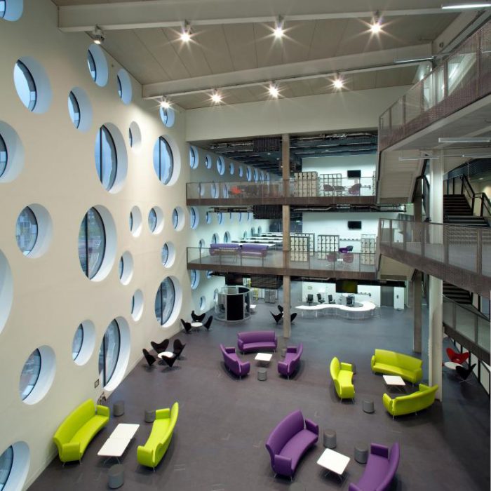
To speak to the college’s ambition to be a global institution focused in the relationship between design and industry, the external envelope of the building is designed as an aluminium rainscreen cladding, comprising of three bespoke tiles that tessellate following a non-periodic pattern. The rainscreen accordingly conceals the exoskeletal structure of the building and provides a variety of window shapes and sizes that both differentiate the open studios by providing different views of the exterior and lighting levels, and express the culture of contemporary production taught in the college.
Museum of Contemporary Art, Cleveland USA
Upon entering the atrium visitors can see the dynamic shape and structure of the building as it rises through four storeys. This view draws the eye towards the primary exhibition space on the top floor, encouraging visitors to explore the displays and events on the first three floors. The atrium leads to a lobby, cafe and shop, and to a double-height multi-purpose room. A grand, ‘double-decker’ staircase inverts the typical linearity of stairs by providing ten different ways to ascend, connecting the floors and reflecting the importance of transience and flexibility. An enclosed, descending egress stair doubles up as a sound gallery and is entirely painted yellow to transcend the boundaries of vision. Ascending from the atrium, the upper levels reveal themselves slowly: the stair leans forward as it climbs following the profile of the building, wide landings provide social spaces and the open route plays out as a panorama.
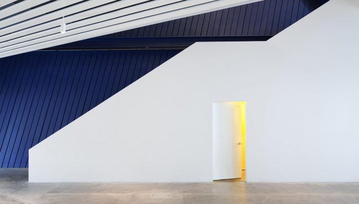
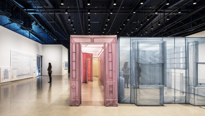
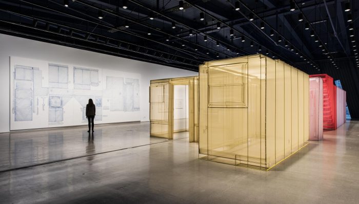
On the top floor the primary 6,000ft² gallery space can be sub-divided for a wide range of art works and media. Here and throughout the building ‘switch elements’ are incorporated – such as moveable walls, glass walls and guillotine walls – so that the spaces can be configured for a variety of uses. ‘Micro-agents’ also allow the building to work hard: for example, display counters in the museum store have wheels so that they can be recessed into the wall to open up the space for events.
Referred to :
Domus, January 2020
Wikipedia
https://www.farshidmoussavi.com/

 Shqip
Shqip