Të dhëna mbi projektin
-
Studio
Anarch
-
Faqja e Studio
-
Statusi
Completed
-
Viti i ndërtimit
2016
-
Sipërfaqja
6500 m2
-
Photography
Artan Hoxha
Përshkrimi
‘Klan Kosova’ TV studios building is one of the first examples of industrial building transformation in the country. By transforming Car Suspenders Factory into TV studios, it raises people’s awareness on recycling and reuse of materials in general. It is a building that yells, screams, whispers, creates sanctuary, absolves old, it moralises, redeems, heel’s. It is an act of defiance. It represents a resistance to new order while looking to the future.
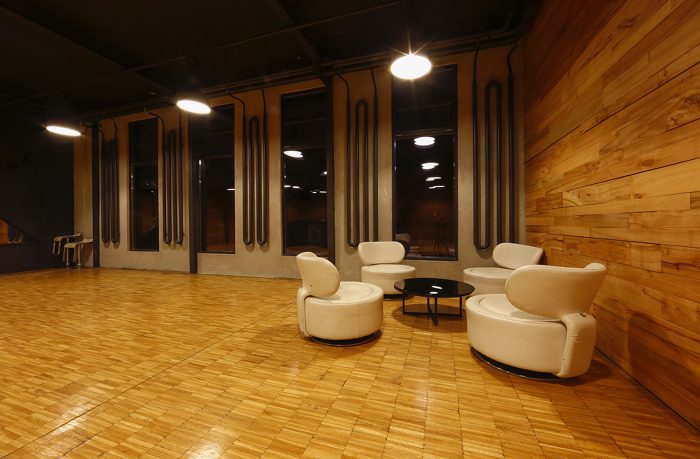
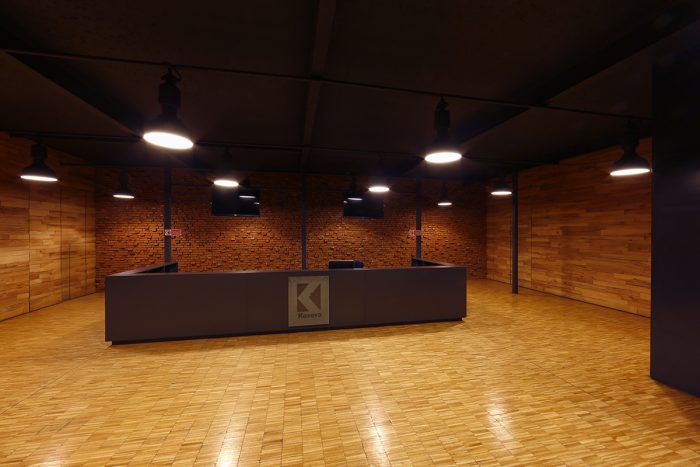
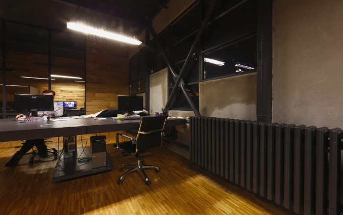
The concept generated from reuse and recycled materials, presents not only rebuild of the shattered building structure with its elements and materials but also it incorporates recycled materials from other parts of the country. Existing elements of the factory such as: chandeliers, radiators and piping used as manufacturing infrastructure are reused not only in their original state but also by giving them different function to contribute as accessories of the new regenerated design.
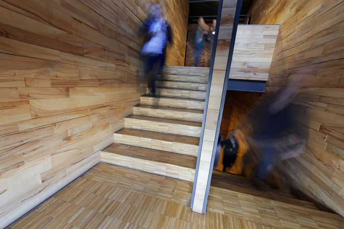
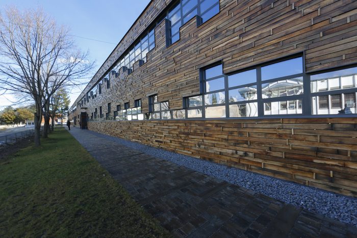
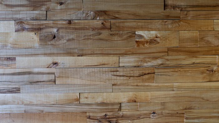
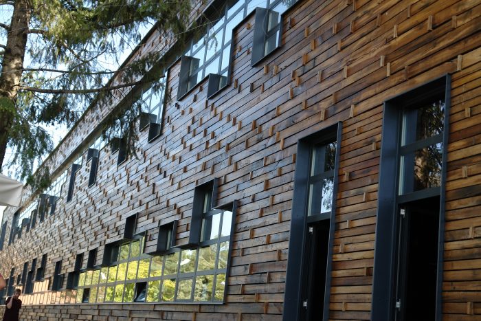
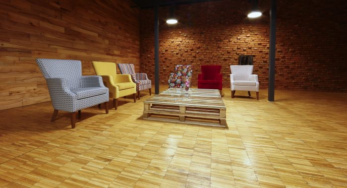
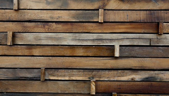
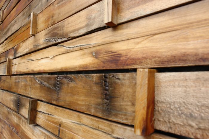
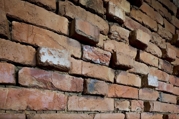
Reuse of a solid waste from different part of the country not only contributed in terms of environmental impact but also in giving the example of how can architectonic expression be created. Interior made out of all recycled materials, utilising bricks from the ruins of burned houses during the war, wooden walls made out of planks taken as refuse on the sows around the country. Exterior made with recycled railway sleeper’s boards composed in natural parametric design, in different sizes and dimensions creates wonderful light and shadow performance bringing motion in architecture.
Building brings to life not only itself and its reused and recycled materials but it emphasizes the social pattern. These characteristics bring a dynamic design to architecture representing embodiment between concepts of environmental and spiritual sustainability.
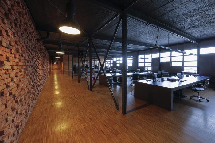
It is a building that yells very loudly by utilising bricks from the ruins of burned house during the war, unique design that translated from the history of the bricks distress, shelling, burning, peoples cry by creating an interior feature. Mudded brick was extracted, cleaned and repositioned as main interior wall, in the contest of remembrance and not by building a memorial, but emphasising memory in every day’s life. 120m in length and 4m in height, in two floors, bricks are laid connected between themselves in traditional muddy mortar. In this specific design a number of bricks are turned outwards to represent the distress, shouts, screams, yelling, gunfire and burning that the same bricks have inured on their previous life. In ecological aspect the countryside is cleaner as much as project required. In the economical aspect poor families were given a modest amount of money as help. In art and architecture local craftsmanship is rebranded and hopefully the biggest impact is that it had turned the tide in respect to the promotion of the local design.
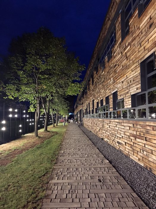
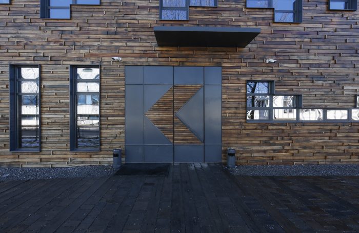
It is a building that screams loudly with its difference, presentation, style, diversity, dissimilarly on its exterior by using the recycled railway sleepers, cut in planks in sawmills. Every 20-25 years’ railway changes the wooden track sleepers. They were used as a burning material for heating. Burning the oil treated wood emitted toxic fumes not healthy for use and environment, therefore by not being able to find their reuse, European Union has listed them as toxic material which needed to be buried deep in the ground. This time around they have had a special meaning because through them were expelled more than a million people during the war, they were not simply the sleepers that need to be buried. The railway sleepers were send to the wood saw, cut into 3cm thick planks in different dimensions to utilise leftovers. Bolt cuts and wooden cracks, represent lifespan in every plank clearly visible on the façade. Natural parametric design is created on the façade onsite by using the vertical spacer, not allow eye to see difference in size between the same lined wood planks. Design allowed maximum usage of the material.
It is a building that whispers KK TV Stations slogan is placed on its façade by presenting simulation of visualisation of equalisers presentation of the sound wave while reading the slogan. Having open space offices, windows are sized allow the maximum daylight.
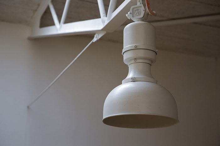
It is a building that absolves old through reuse of the existing elements of the factory. Reuse of chandeliers surprisingly found in very good condition, hanged height on the building structure.
Cleaned, electrically modified to suit todays requirement of the light efficiency and painted became a visible component of expression of the building past use.
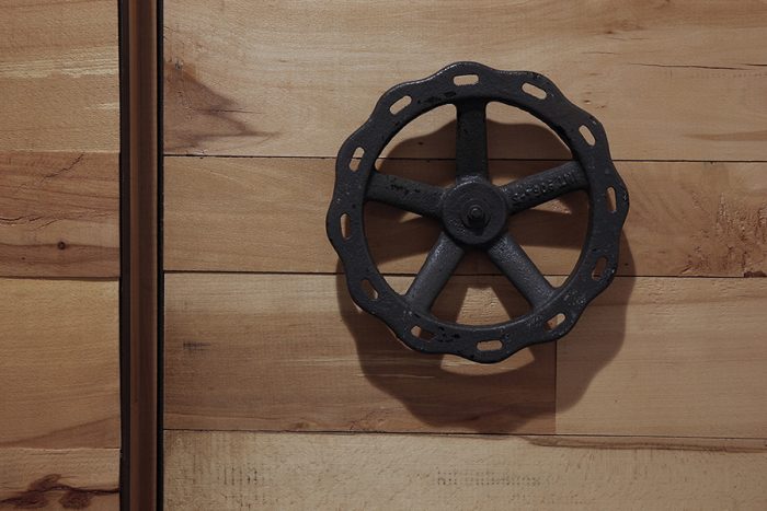
This clean retro use of the old elements is visibly seen also in reuse of the existing radiators and pipes originally used as manufacturing infrastructure. Pipes were used in creating ducting for new infrastructure for electric and electronic cabling, used as radiator and desk holders.
It is a building that creates sanctuary to all of its users, with spacious, representative, inspirational and safe environment. Personnel that uses this environment has become very creative. The building personality if conveyed on its users, stubborn and defiant looking forward to changes in all ranks of society. Building shows that people can do it, if they put their mind to.
It is a building that moralises with respect to architecture. It presents different approach to globalization, use of natural materials, opening back discussions on environmental use and wellbeing.
It is a building that redeems with anarchitectural view and approach to problems of globalisation and uniformity by presenting uniqueness and personality. Have we become society of all similar personalities presented through global architecture, or there is a different DNA to every single one in us. Building redeems individuality presented through materials and design, scars in reused and recycled materials present that individuality.
Vendndodhja
Prishtina, Kosovo


 Shqip
Shqip