- Permbajtja
- prev
- next
- prev
- next
“Drawings – landscapes, portraits, and trip sketches – have always kept me busy. I don’t think that it has a direct relation with architecture but it is a good way to develop acuity of vision. There are two different words in portuguese that mean “to look” and “to see and understand” (olhar and ver). The tool of an architect is to be able to see”. - Álvaro Siza
Architectural drawing is an act of communication. Creating both a vision for what could be and detailing the technical relationships of design and construction, architects use drawings as a way to explore, express and share their ideas. From the basic concept of architecture as shelter, there are now countless definitions of what the built environment should provide. In turn, those definitions are continuously shaped by drawings.
Looking across history, drawings have been used throughout millennia as a way to imagine new realities and rethink the world around us. But they have also changed architecture itself, communicating radically new architectural theories and opening up concepts that would play a key role in the dialogue across the profession for years to come.
1. Antoni Gaudi
Gaudi was an architect who liked his creations to grow organically and although his buildings would be drawn out at an early stage, there would be plenty of detail to be decided upon as the construction started to take shape. This famous Catalan would take on some demanding commissions which involved producing a large number of different items that would all need to fit stylistically by the end of the project. In order to achieve this he inevitably required the help of a number of skilled assistants, which meant his drawings were essential for guiding them in the right direction and avoiding a divergence from his original ideas.
Despite the tragic loss of many Gaudi drawings due to a workshop fire in 1936, there are still many artworks from his time as a draughtsman still in existence. This artistic discipline provided the backbone to everything else that he produced during his varied and extensive career.
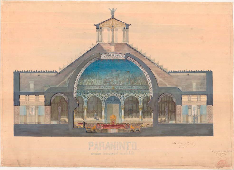
Auditorium: cross section, 1877.
2. Frank Lloyd Wright
Frank Lloyd Wright is certainly America's most famous architect and can lay claim to being America's most important artist of the 20th century. His career spanned over 60 years and spawned a series of masterpieces starting with his early 1900's Prairie style houses and ending in 1959 with the Solomon R. Guggenheim Museum. He is by all accounts a modern master.
It all started with a pencil sketch of a façade that Frank Lloyd Wright did in 1888 when he was trying to get a job from the man he later came to call his “lieber meister,” or dear master, Louis Sullivan. 21 at the time, the architect sketched with more assurance and clarity, evoking a design of great polish and beauty with such evocative economy.
Fallingwater in rural Pennsylvania is one of the most iconic works of Frank Lloyd Wright’s architecture. Designed for the Kaufmann family in 1935, Fallingwater blends seamlessly into the forest greenery of rural Pennsylvania, cantilevered over a rushing waterfall. It mirrors the natural pattern of surrounding rocks with its stacked shape, built from concrete, glass and stone.in rural Pennsylvania is one of the most iconic works of Frank Lloyd Wright’s architecture. Designed for the Kaufmann family in 1935, Fallingwater blends seamlessly into the forest greenery of rural Pennsylvania, cantilevered over a rushing waterfall. It mirrors the natural pattern of surrounding rocks with its stacked shape, built from concrete, glass and stone.
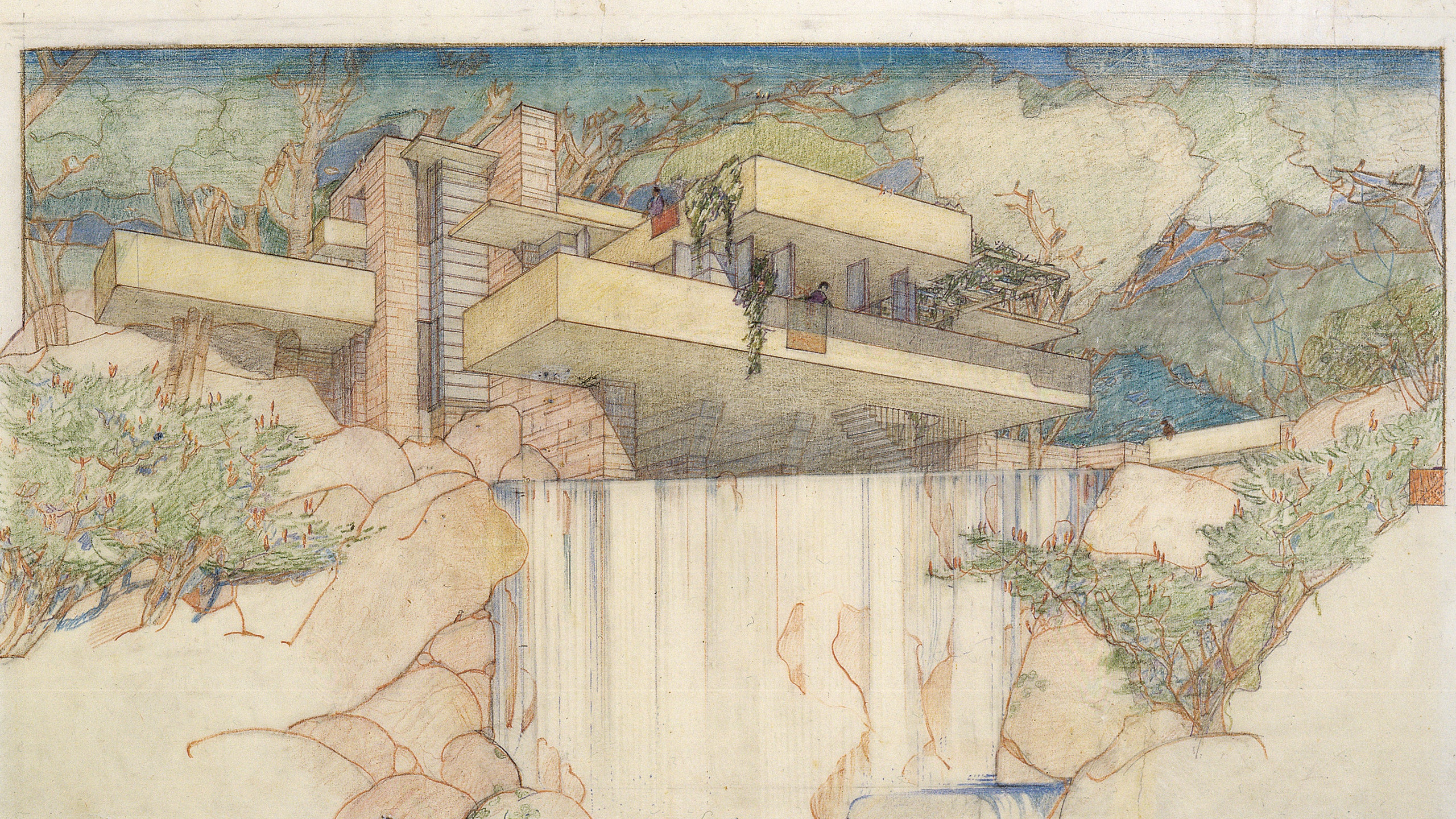
Frank Lloyd Wright and his chief draftsman, John H. Howe, drew this image of Fallingwater in 1937.
3. Louis Kahn
Architectural drawings and sketches often serve as an insight into the early ideas behind what can then become an iconic building, celebrated both in our lifetimes and in ones to come.
In the case of Louis Kahn however, his drawings were, on occasion, not only the driver behind a new building but a complete about turn in his entire architectural practice.
In graphite, watercolour and crayon, they are, on the whole, an astonishing body of work, in contrast to the formalism of his buildings, cloaked in an air of romanticism which brings to mind the work of the artists - Picasso and Matisse especially – who inspired him.
Kahn's drawings, like his work, were inspired by his extensive travels, both in his early trips to Europe and, in later years, beyond. His architectural experiments with light, form and shape are presciently foreshadowed in the sketches themselves as they progress from the earliest simple outings to the energetic flourishes he brought to them in later years.
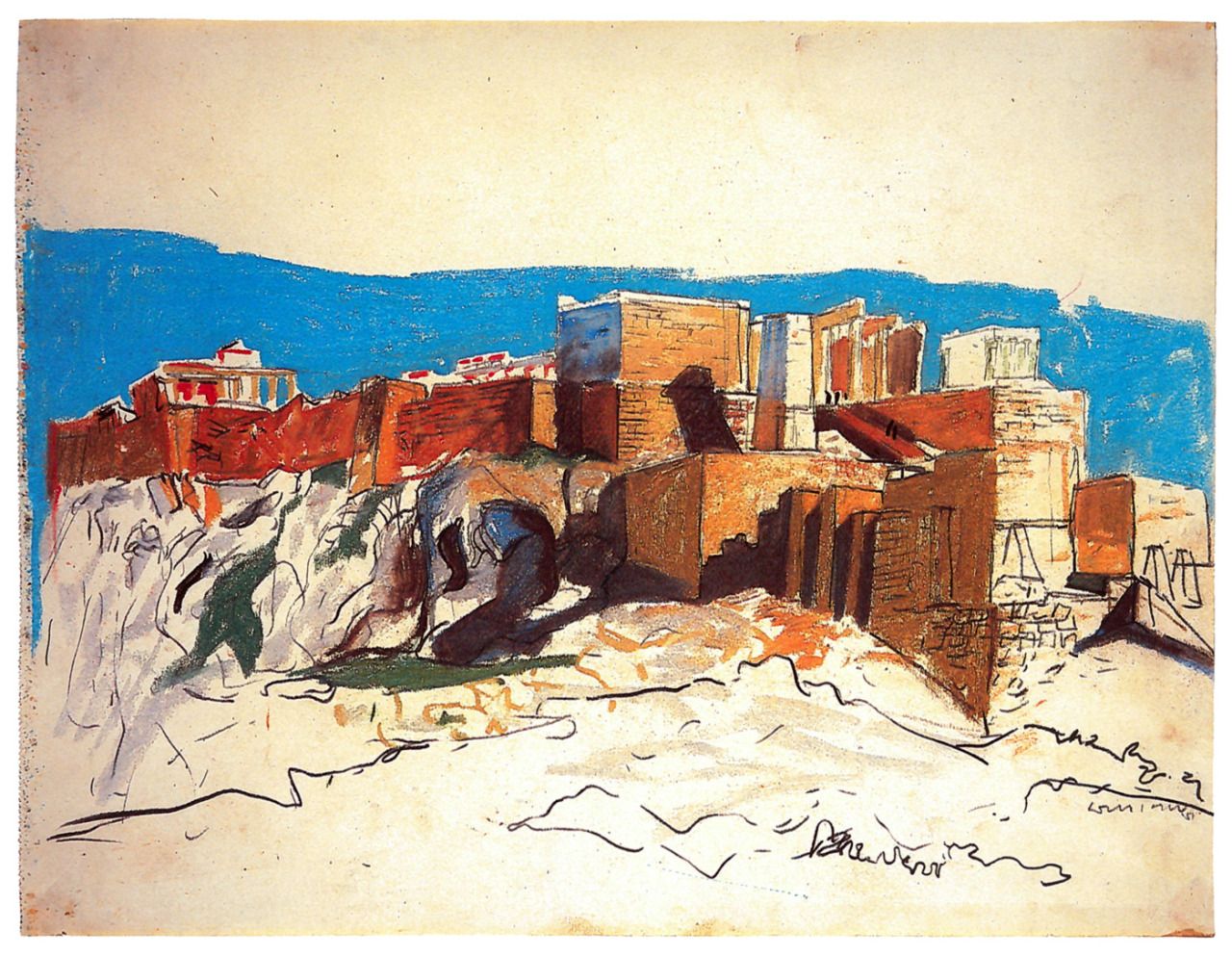
Louis Kahn travel drawing.
4. Le Corbusier
Charles-Édouard Jeanneret, known as Le Corbusier, is famous for transforming 20th-century architecture and urbanism. Less attention has been paid to his artistic production, though he began his career as a painter. Even after Le Corbusier turned to architecture, he continued to paint and draw. Le Corbusier was a deeply radical progressive architect, a futurist who was equally and fundamentally rooted in history and tradition. He was intensely curious, constantly traveling, drawing, painting, and writing, all in the pursuit of becoming a better designer.
As a result, he found intellectual ways to connect his historical foundations with what he learned from his contemporaries. He grew from drawing nature to copying fourteenth-century Italian painting to leading the Purist movement that greatly influenced French painting and architecture in the early 1920s. All the while, he was making connections between nature, art, culture, and architecture that eventually gave him a foundation for thinking about design.
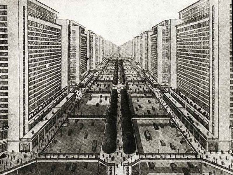
Ville Radieuse: Le Corbusier’s Functionalist Plan for a Utopian “Radiant City”
5. Ettore Sottsass
An Italian architect and designer known for his large oeuvre including furniture, jewelry, glass, lighting, and office design, Ettore Sottsass was also the founder in the early 1980s of the Memphis Group. Drawing inspiration from such movements as Art Deco and Pop Art, Memphis produced and exhibited furniture and objects that were vibrant in color and futuristic in design. Sottsass’ own work was known for its variety, oftentimes incorporating playfulness through ornamentation and color.
From childhood, Sottsass greatly enjoyed drawing, quickly sketching things he observed throughout his daily life. Drawing was however, ultimately not enough for him. Sottsass also carried with him a small camera that he used to document everything: doorways, furniture, kitchen sinks. Nothing was irrelevant to Sottsass, as by incessantly documenting everyday mundanity, he was trying to understanding and gather together the pieces that would shape his human-centric vision of design.
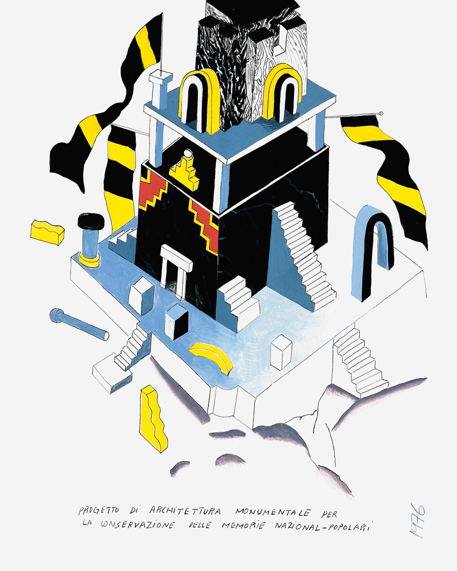
Ettore Sottsass’s Progetto di architettura monumentale per la conservazione delle memorie nazional-popolari, 1976, was part of an exhibition on radical architecture in Bologna, Italy.
6. Michael Graves
Michael Graves was one of the most celebrated american architects and designers of the 20th century. Nearly 5,000 drawings, which span from informal sketchbook studies to full-color building elevations of some of the architect’s best-known structures, joined the Princeton University Art Museum collection at the institution where Graves taught for 39 years. Using graphite, pen, oil pastel, and color pencil, Graves formed his sketches across a range of media, including copy paper and yellow tracing paper. The diverse set of drawings is representative of the iconic architect’s expansive oeuvre and reveals the development of his vibrant postmodernist style over the course of his career.
“Architecture cannot divorce itself from drawing, no matter how impressive the technology gets. Drawings are not just end products: they are part of the thought process of architectural design. Drawings express the interaction of our minds, eyes and hands. This last statement is absolutely crucial to the difference between those who draw to conceptualize architecture and those who use the computer. Drawing by hand stimulates the imagination and allows us to speculate about ideas, a good sign that we’re truly alive.”
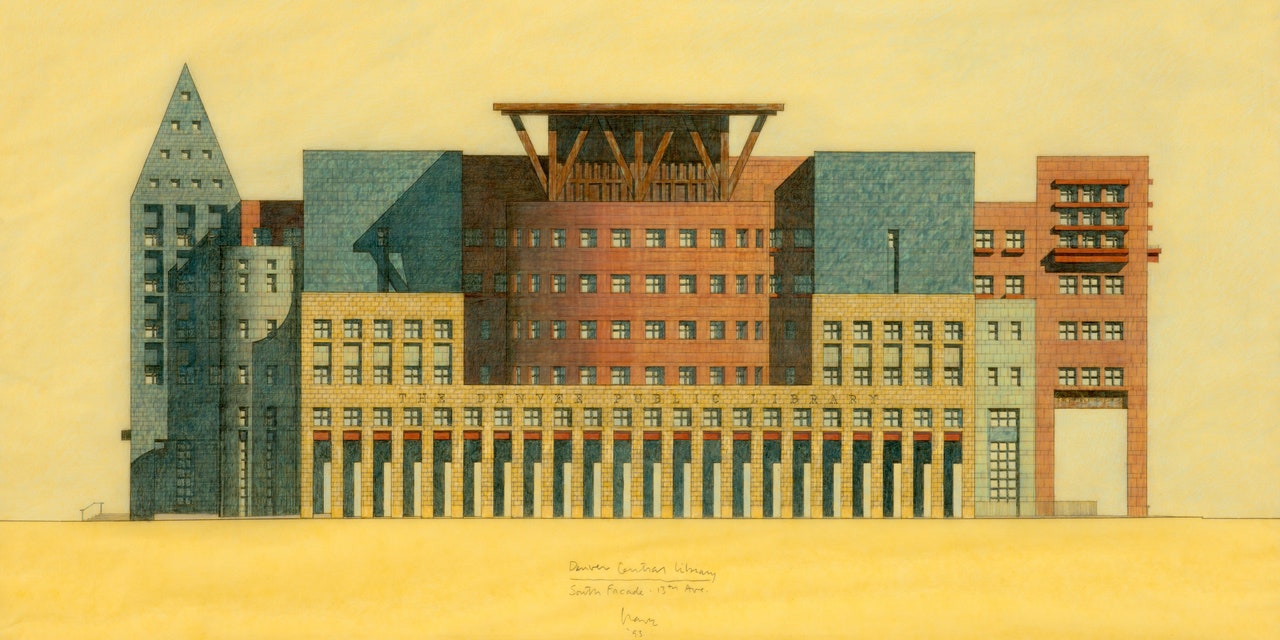
Michael Graves, Denver Central Library, South Facade, 1993. Graphite and colored pencil on tracing paper.
7. Zaha Hadid
Zaha Hadid revolutionised the language of architecture and transformed the way we think about design. An artist who sought to question everything taken for granted, she created some of the most spectacular buildings of the 20th and 21st centuries. Hadid’s specifically, reflected a way of drawing and painting each architectural project that expressed the power of her experimentation and radicalisation against architecture’s norms. It was an experimentation that crossed the divide between spatial practices found in architecture with those in painting.
The unbuilt competition winning design for The Peak in Hong Kong was intended to be a sports club and spa. The Peak is considered to be Hadid’s breakthrough project and a pivotal moment in her investigation of painting as a design tool. Pushing the traditional boundaries of architectural representation, Hadid’s early paintings and drawings explore the potential of dynamism and distortion by superimposing sharp planar elements and overlaying multiple perspectives.
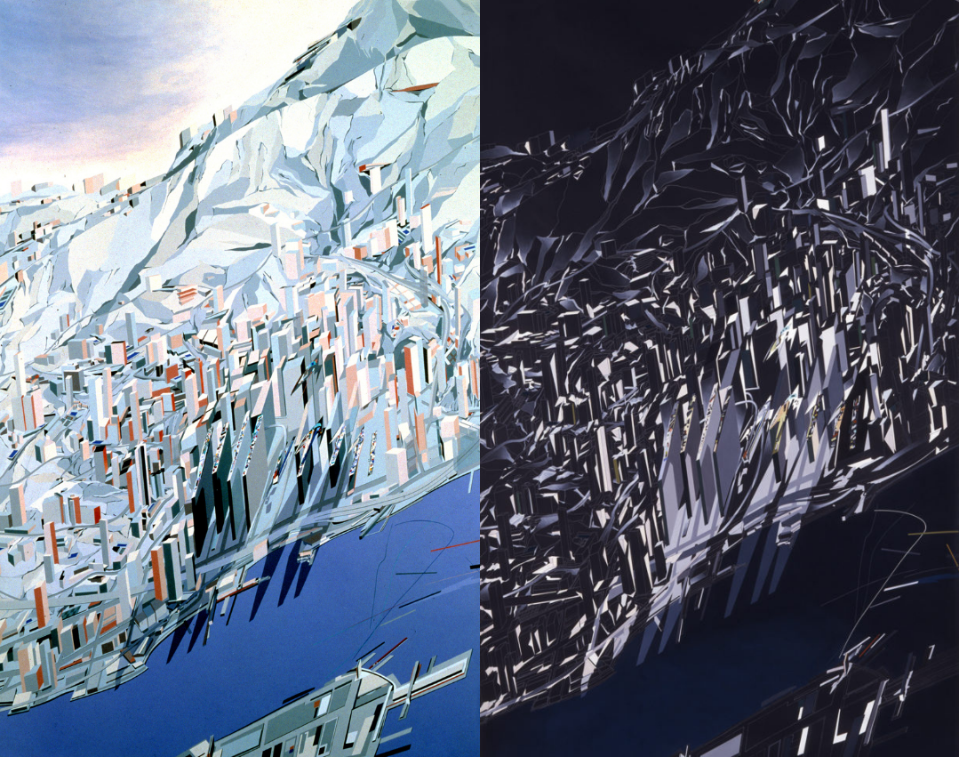
Zaha Hadid used colored pencil and paint to create this 1982 drawing of The Peak Leisure Club, a private club in Hong Kong. The project was never built, however, because it was impossible to do without computer-aided design—technology that didn’t exist yet.
8. Santiago Calatrava
The Spanish architect Santiago Calatrava is one of the most well-known and celebrated architects of our times. Along with being a talented architect and structural engineer, Calatrava is also a sculptor and painter. While he has claimed to not follow any particular architectural style or movement, he has drawn inspiration from the works of engineers and sculptors. As an architect, Calatrava is fascinated by the concept of movement in buildings and sculptures. He has often tried to translate this idea of the flexibility of structures into many of his projects with varied success. The Turning Torso in Malmo is one of his most popular designs which originally started as a sculpture.
His designs have proven that art in its many forms is an intrinsic component of architecture. The human body has also been one of the major inspirations for Calatrava’s designs. He is also inspired by numerous other natural elements like sea waves and bird wings. Several of his buildings and bridges open like a bird extending its wings, graceful and beautiful at the same time.

Santiago Calatrava Turning Torso Sketch
9. Steven Holl
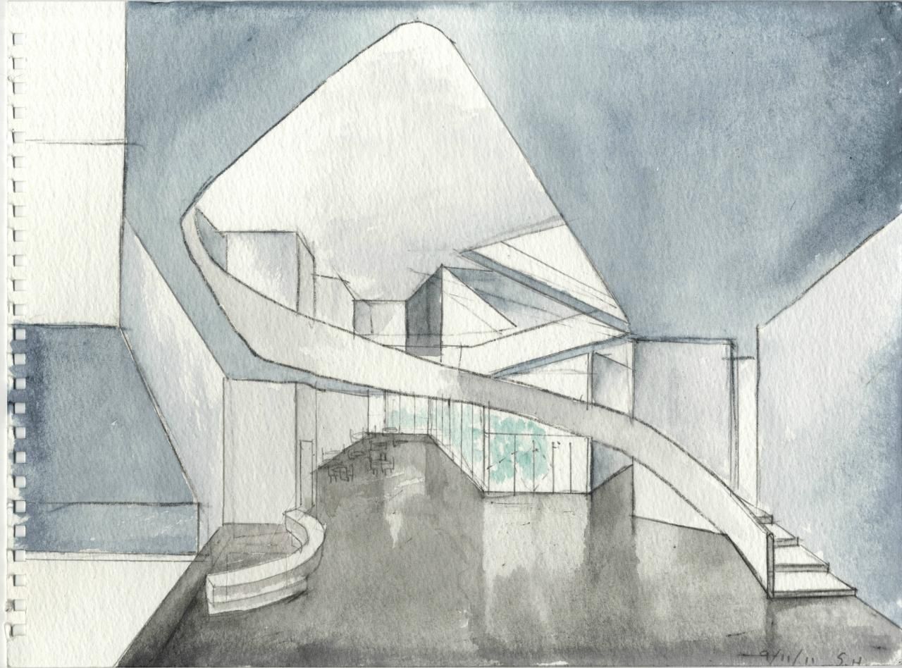
“I used to do pencil drawings. Those took eight hours. Around 1979, I streamlined it to five-by-seven-inch watercolours, because they were easy to travel with.” - Steven Holl
Holl’s watercolours has become his signature, a truly unique style of visualization and one that continues to inspire awe among his fellow architects. Steven Holl has always been drawing. For him, he says, it’s a form of thought. He is known for his sculptural, almost Corbusian approach to architecture and natural light. And while watercolors may seem an obvious choice for visualizing these characteristic aspects of his work, it took a while for Holl to exchange the pencil with the brush – and surprisingly, when he did so, it was for purely practical reasons.
“With the watercolor, in the quickest way, I can shape a volume, cast a shadow, indicate the direction of the sun in a very small format. And I can carry these things around because I am always traveling.”
