
- Permbajtja
- prev
- next
- prev
- next
Peter Behrens and Symbolisms of Industrial Design: The Case of AEG
by Artea Zera, "Thresholds of XX century architecture" EPOKA University
Abstract
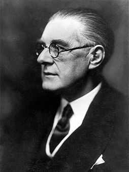
This paper explores the philosophy, inspirations and style of Peter Behrens, the first industrial designer and the father of corporate identity, by examining his work for the AEG company. A trained painter, Behrens was a talented visionary who excelled in various fields, including art, academics, architecture, and design. He believed in integrating art and technology as the only path towards societal progress, and developed a rational and functional language of architecture that emphasized simple geometric forms and a rethinking of the traditional canon. In the 1910s Behrens worked as the artistic director for the corporate giant AEG, transforming the company's identity into a brand of power, excellency, and reliability. But more importantly, he showed artists how to adapt to a new role in society during a time of significant change, as active participants, educators, and guiders towards modernity.
Peter Behrens: A brief Re-Introduction
Peter Behrens, often hailed as the first industrial designer, was a talented visionary who ventured successfully in art, academics, architecture and design, all the while embracing the industrial spirit of the 20th century. Behrens was among the first and best designers who worked successfully in industry, welcoming new innovation without surrendering his artistic sensibility (Anderson, 1977). To him, integrating art and technology was the only way towards progress and modernity, setting new values and creating a new culture (Kultur). This vision was the main theme of his architectural exploration.
Born in a wealthy family on April 14, 1868 in Hamburg, Germany, Behrens pursued many talents (Harald, 2019). He studied art in various academies and excelled in many disciplines, including painting, wood-cutting, furniture-making, typography and product design. Behrens was a cultured and talented man and was an active member in artistic communities, like the Munich Secession, the United Workshops for Arts and Crafts, the Darmstadt Artists’ Colony and later the Deutscher Werkbund. He also undertook academic pursuits, teaching in different cities. All the while, Behrens pursued architecture privately and developed his own comprehensive philosophy of architecture, that distinguishes him as one of the early masters of modernism.
Peter Behrens developed a rational and functional language, he argued that ‘architecture was the art of defining space’. He favoured the use of few, simple geometric forms and argued that their volume, the art of pure spatial occupation, provided the artful aesthetics of architecture, rather than mere decoration. Common in the works of Behrens is his own type of ‘classicism’, a rethinking of the traditional canon, where he removes all non-functional detail in favor of the pureness and beauty of proportions, contours and solidity of volume (Enso). His embrace of rational and pure forms, simplicity and technological means of building set the tone for a new modern architecture, that inspired modernists in the years to come.
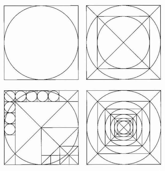
Compositional Grid System, J. L. M. Lauweriks
A Language of Symbolism
Industrialism and technological advancements brough about a conflict in design, where the new era of standardization and functionalism could replace artistical individualism (Boztepe, 2012, p.79). Peter Behrens is one of the few avant-garde intellectuals of the time, who pushed artists to embrace ‘the technological spirit’ of the time, to integrate art with industry and create a true modern society.
The works of Behrens have an overly functional and industrial character outwardly, although he was careful to enrich them with a sensible artistic quality. In fact, prior to his work as a product designer, Behrens had been a member of numerous artistic groups and he fit right in with these ambitious artists. His friends were designers, painters and poets and ‘art’ is never missing in his work.
Theosophical Influences
Ever since he was a young artist, Behrens was drawn to geometry as a foundation for architectural method and cultural meaning. The School of Beuron and the work of von Thiersch in particular, were a great influence on Behrens, and helped him establish his own geometric order, where repetition of figure was essential, particularly of the square as a basis for intelligibility and harmony (Henderson, 1999, p.5). His quest for a timeless form aligned with that of another great architect and theoretician, the theosophist J. L. M. Lauweriks. He was a prominent theoretician who had great impact on early 20th century artistic movements, with his geometrical proportional symbols. Him and Behrens worked to redefine art as something sublime.
Behrens and AEG Collaboration: The First Corporate Identity
After pursuing various academic and private architectural ventures, by 1905, Behrens had delivered a few design orders for the Allgemeine Elektricitäts-Gesellschaft (AEG) turbine factory in Berlin, that had for a time ventured into producing domestic appliances. His first commission had been the redesign of their arc lamps, a venture so successful the company later commissioned the redesign of its kettles, coffee pots, fans, clocks and many others. In 1907, Behrens was offered the position of artistic consultant for the AEG company. There he completely revolutionized corporate identity and came to control every visual display of the company; product design, graphics, advertising brochures and building design.
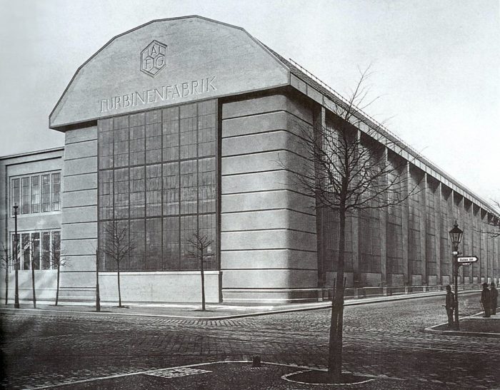
Building for AEG
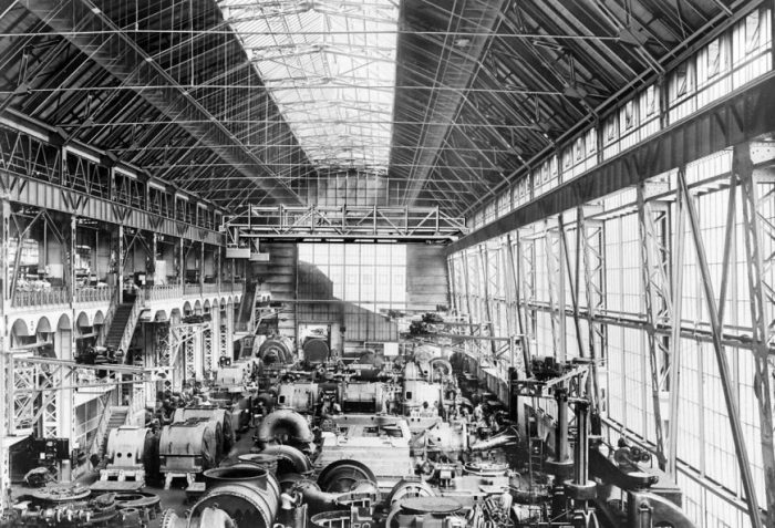
Behrens had a keen understanding of scientific management principles and this was evident in the spatial arrangement of the ‘Behrens’ factory; a clear layout with open, uncluttered halls that permits and eases movement of products, tools and machines, with elevators and stairs moved to the exterior, creating a long progression of uninterrupted work space.
Behrens considered light to be the prerequisite of good work, (Behne, 1996, p.107-108) and the factory had to be well-lit with rows of large openings that dominate the exterior, while creating a ‘friendly’ outside. The factory had to be impressive and at the same time, represent the mechanization processes occurring inside. For him, the factory was the ‘touchstone’ of the industrial age. (Anderson, 2000, p.111)
Behrens designed the first exhibition pavilion for the company in 1908, for the Shipbuilding Exhibition in Berlin. It was an octagonal, austere, classical reminiscent building, inside which the machines were exhibited like sculptures. This building sought not only to highlight the usefulness of AEG’s products, but rather to exhibit them as objects, full of modern industrial potential. With this first octagonal plan, Behrens proposed a new symbol for AEG, the ‘crystal’, meant to show people the ‘many faces of the company’, with polygonal logos and facades.
In 1909, he designed his most celebrated work, the AEG Turbine Factory, often hailed as a monumental temple of production (Merrill). Behrens incorporated modern materials and construction techniques into this form, which he developed by adapting conventional architectural features into a new ideal. In architectural discourse, three claims were made on the Turbine Factory.
The first outlook was the building was an implementation of industrialism and functionalism, devoid of any decoration, the building was devoted to its use and function, created by the ‘machine-hand’ of Behrens. The second view is that the building is one of the first landmarks of modern materials, surfaces and techniques with no extraordinary space articulation. The third outlook is that the building is a monument, a symbol of German industrial power and a ‘cathedral of labour’, a ‘dignified place of work’. (Giedion, 1967, p.479)
Products for AEG
Peter Behrens was very experienced in all fields of design, including product design. However, designing for such a large corporate was not an easy feat and for that Behrens had to examine consumer behavior, which at the time was largely unheard of. Behrens’s product designs for AEG were functional and pure, reducing costs and easing manufacturing and attracted all types of buyers with their aesthetical simplicity.
AEG set a precedent for modern design and the idea of ‘comfortable’ living, with household items being easy to use and easy to please the eye. (Hiesinger, 1993) Many were so influential, that they became ‘types’. The first product designed for AEG was the ‘Arclamp’ in 1907, completely unique from both the overly simplistic and linear lamp, as well as the heavily embellished lamp, popular at the time. Here, the electrical and mechanical components were not hidden, but used as tools of beauty.
Table fans, clocks, toasters and many others were also popular products, simple and geometric with some classical features, that helped establish a strong and consistent language for AEG, one that was recognisable and unique in the market. But perhaps, the most iconic of Behrens’s products is the Kettle.

Graphics for AEG
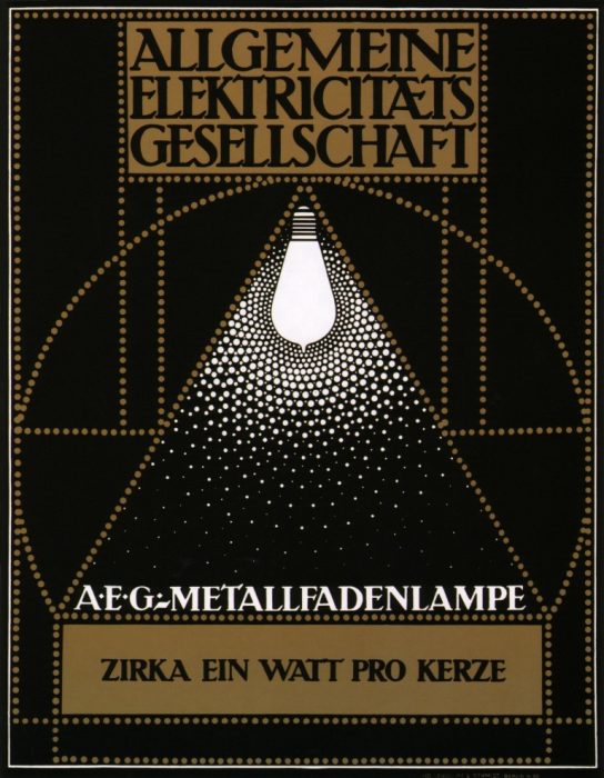
For Behrens, typographic designs were crucial in a company’s publications and he designed a new graphical language for all advertisements of AEG, as well as its logo. He crafted a pure, geometric language of simple forms and bright colors. His brochures were simple and communicative, with the abbreviation AEG and the name of the product at the top, the description and city at the bottom, an image of the product took up most of the advert space; there was no need for a slogan, the product was the advertisement. This unique expression became a reliable trademark for AEG, recognisable in the market. It is among the earliest forms of corporate identity.
Lessons from A Master
With the Industrial Revolution the idea of trademarking one’s business had become popular with businesses and companies creating logotypes as visual identifiers. Still, the notion of ‘corporate image’ or ‘brand’ did not emerge until the 1940s, and very few keen businessmen had seen the value and power of developing and promoting an identity at the time. Such was the case of the corporate giant AEG, that in the early 1900s had become quite conscious about the lacking aesthetics of its image in the market.
AEG’s collaboration with Peter Behrens led to a transformed company identity, a brand of power, excellency and reliability, that the brand still maintains more than a century later. Although a common and crucial practice of corporate management today, what Behrens accomplished as artistic director for AEG was a bold and controversial experiment back then.
Through a communicative but delicate language and a functional design program, he built AEG’s brand from the ground up. His factories, shop displays, products, typefaces and advertisements spoke the same language and the same message, distinguishing AEG from competitors in the market. His understanding of production and management practices, as well as costumer behavior helped create a personalised program of advertisement that many contemporaries began to follow. Behrens is now often seen as the father of industrial design and corporate identity.
Most importantly, however, Peter Behrens showed artists how to confidently adapt to a new role in society in an era of daunting changes, not just as bystanders, but as active participants, educators and guiders towards progress and modernity.

 Shqip
Shqip